Troubleshooting Text-to-Image Issues: Fixing Artifacts, Lighting, and Color Inconsistencies
Aug 15, 2026 • 9 min
If you’ve ever tried to generate a photorealistic car image on a phone, you know the drill. The text prompt looks precise, the concept seems solid, and then—artifact city. Distorted panels, weird wheels, lighting that makes the scene feel staged rather than real. It’s maddening, especially when you’re trying to move from concept art to marketing visuals on a backendless mobile workflow.
I’ve spent years squinting at AI car renders, watching small choices in prompts ripple into big, ugly flaws. And I’ve learned that the path from rough concept to credible image isn’t about a single magic prompt. It’s about an iterative, mobile-first process that treats artifacts, lighting, and color as three separate, solvable challenges. Here’s how I approach it, in a way you can apply on a lunch break or during a quick design sprint.
A quick moment I can’t shake from my memory: I generated a concept car on my phone in the middle of a train ride. The image looked great at first glance, but the chrome trim on the doors reflected the train’s fluorescent ceiling lights in a way that felt cartoonish. I paused, pulled up a reference image of real chrome reflections, and re-ran the render with a tighter negative prompt for reflections. The next iteration came back clean enough to use in a quick social post. It’s the small, deliberate tweaks that add up.
And a micro moment I learned from: during one session, I watched the AI misinterpret a subtle paint finish—“metallic charcoal” turned into a flat, dull gray. A 1–2 sentence change in the prompt—specifying a “tight, micro-sparkle metallic flake in direct light”—made the paint pop without losing realism. It’s in these tiny prompts where the difference shows up most clearly when you’re sprinting and need reliable feedback fast.
How this guide is different. I’m not promising a silver bullet. I’m laying out a practical workflow you can use on mobile, with the tools you already have. You’ll learn to:
- Identify and prevent artifacts that pull you out of the scene.
- Align lighting between the car and its environment so the image feels cohesive.
- Control color and tone so your vehicle reads as real, not rendered.
- Iterate prompts and use mobile-friendly post-processing to close the gap between draft and publish-ready visuals.
If you’re after clean, credible car renders for social, spec sheets, or a marketing tease, this approach keeps you in motion—without depending on a desktop workstation or a back-end pipeline.
Understanding the common AI image flaws
Before you can fix them, you’ve got to know what to watch for. The most painful issues tend to cluster around artifacts, lighting, and color.
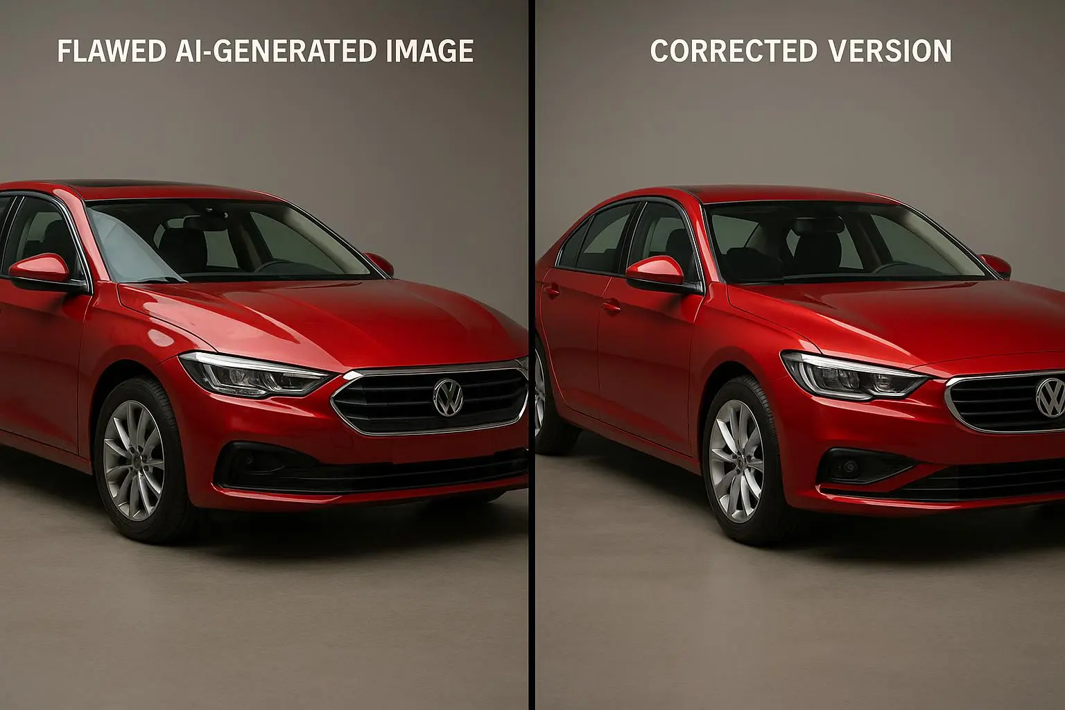
Artifacts and distortions are the loudest tell. You’ll get extra wheels, jagged edges on doors, or textures that look off in ways you can’t quite describe. These flaws come from the AI’s struggle with complex geometry and high-detail materials. In practice, you’ll notice them on sharp corners, wheel hubs, or reflections that don’t map correctly to the surface.
Lighting inconsistencies are more subtle but equally fatal. If the car looks lit from a different direction than the background, the entire image loses realism. Shadows may be in the wrong place, or the car may feel lit as if it exists in a studio while the world behind it is outdoors at dusk. It’s the illusion killer.
Color mismatches are the mood-breakers. A car might end up with a hue that reads slightly off, or the environment’s light warps the paint beyond what you expect. If you’re aiming for a deep jewel tone or a precise metallic finish, those expectations require careful prompts and post-processing.
And then there’s perspective and reflections. Cars are glossy mirrors; that chrome and glass love to catch the world around them. AI often drops the ball on accurate reflections or distorts them, which makes the whole render feel flat or fake.
A quick aside that stuck with me: I once spent an hour chasing a “city night” reflection. The prompt kept insisting the car’s surface should reveal neon signs, but every pass showed a sky glow and a few random street lamps. I realized I’d been mixing two lighting directions in my prompt—one for the environment, one for the car’s surface. The fix was simple: explicitly state the light source direction for the environment and tie the car’s surface reflections to that same axis.
Prompt engineering for precision: your first line of defense
The prompt is your camera, your lighting director, and your colorist all in one. The more explicit you are, the less the AI has to guess—and guessing is where these flaws creep in.
- Be Hyper-Specific. Don’t settle for “red sports car.” Try: “A 2024 electric sports car, matte metallic crimson, parked on a wet city street at blue hour, with deep reflections on the hood and chrome accents. Low-angle, wide shot.” Add environment details, time of day, camera angle, and material properties.
- Use Negative Prompts. It’s not cheating; it’s communication. Tell the AI what you don’t want: “no extra wheels, no warped mirrors, no watermark, no pixelation, no jagged edges.” If you’re chasing realism, this becomes your shield against the parts of the model that slip.
- Iterate, but with purpose. Start simple, assess, then tighten. If the wheels look off, refine the wheel area in the prompt or crop and inpaint later. If reflections read wrong, call out the exact surface and the reflection direction.
I’ve found this workflow pays off quickly on mobile, where you want to see meaningful improvements with each pass. Prompt, render, compare, adjust. Small tweaks compound into big gains in just a few minutes.
A concrete example from my own practice: I wanted a car in a rainy alley with neon signs. My first pass gave a nice silhouette, but the neon reflections were smeared and the rain looked pasted. I added a line to constrain the reflection map to the car’s surface geometry and included a negative prompt to avoid “glossy noise” on the wet pavement. The next render captured crisp neon reflections on the car and a believable rain gloss on the asphalt.
Addressing artifacts and distortions on a mobile workflow
Your phone is not a toy here; it’s a tool. The right sequence helps you reduce noise, fix geometry, and salvage details without climbing into desktop software.
- Upscaling is your friend, not your crutch. After you’re happy with a draft, upscale within the app. This helps smooth minor artifacts and reveal subtle textures that were hidden in the lower-res version. If your app doesn’t include it, a quick hop to a dedicated mobile upscaler—Remini or Fotor—can yield noticeable improvements.
- Inpainting and outpainting when available. Some mobile editors let you select a region and regenerate it with new prompts. A small fix, like re-rendering a door panel or a wheel, can pull the entire image into alignment. I’ve seen inpainting save images that would have been scrapped otherwise.
- Seed control for consistency. If you can set a seed, lock it when you iterate. It keeps the structure similar across passes, so you’re not chasing a moving target as you tweak prompts.
A moment from a recent session: I was chasing a chrome trim that kept reflecting the wrong lights. I isolated the trim as a separate layer and used a negative prompt to push away the stray reflections. The updated render showed coherent reflections on the chrome that mirrored the environment, and the car no longer looked like a cut-out pasted into a scene.
Mastering lighting and reflections for realism
Lighting is the backbone of realism. The same car can look cinematic in one scene and flat in another if the light isn’t matched across the environment and the subject.
- Use environmental cues in prompts. Describe the lighting rather than relying on generic terms. Try phrases like:
- “Golden hour sunlight, long dramatic shadows, warm glow, high specular highlights on curves.”
- “Overcast sky, soft, diffused light, gentle shadows.”
- “Neon street at night, reflections of blue and pink signage on glossy surfaces.” This level of detail gives the AI a guidepost for how light should interact with the car’s material and form.
- Make lighting consistent with the background. If the background reads bright and sunny, the car’s highlights should align—sharper, more defined shadows, crisp speculars. If the scene is misty or dawnish, go for softer shadows and more diffuse reflections. Realism hinges on this coherence.
- Tie reflections to the environment. For chrome, glass, and glossy paint, specify that reflections should clearly show the surrounding scene. If you want city lights, name them. If you want the car to reflect raindrops on the window, call it out. The more explicit you are, the less the AI has to guess.
A practical note: if your background is indoors with strong tungsten lighting, you’ll want the car’s color temperature to align—cool white highlights with warm ambient fills can feel off. I solved this by explicitly stating color temperature in the prompt and nudging the white balance in post-processing on mobile.
Correcting color and tone without losing realism
Color is the mood dial. It’s easy to push a hue too far or drain a finish until it looks flat.
- Be precise about color names and finishes. Instead of “red,” use “crimson with a subtle metallic flake.” For black, try “deep gloss black with micro-metallic specks visible in bright light.” For white, consider “ice white with a faint pearlescent shimmer.” The right descriptor nudges the AI toward the exact look you want.
- Consider color temperature. Words like “cool,” “neutral,” and “warm” guide the overall tone. If you’re aiming for a stealthy, premium feel, you might push toward cool, desaturated highlights with a restrained bloom.
- Post-processing on mobile matters. After a render, you’ll want to adjust saturation, contrast, and white balance. A quick tweak to warmth can shift a color from “almost right” to “perfect for the shot.” Tools in Canva or Fotor let you do targeted color curves and selective saturation so you don’t overdo the entire image.
A story from a recent project: I had a concept car in matte graphite. The AI delivered something close, but the gray felt flat. A targeted color curve increased mid-tone contrast while lifting a subtle blue cast in the highlights. The result was a graphite that read both modern and premium, not flat and dull.
The backendless mobile workflow: advantages you should lean into
This isn’t just about making pretty pictures on a phone. It’s about how fast you can iterate and how quickly you can get to something usable for your workstream.
- Immediacy. Generate, assess, adjust, repeat. You’re not waiting for downloads, render farms, or a desktop session. On a lunch break, you can prototype multiple concepts and knock out a few passable options.
- Accessibility. You don’t need expensive hardware. A mid-range phone and a good internet connection is enough for a solid workflow, plus some light post-processing on mobile apps.
- Iteration speed. The biggest win is being able to go from prompt to near-final in minutes, not hours. This changes how you think about the design process. You learn faster because feedback loops are tight and visible.
What you give up is some advanced tooling and the deepest control you get in a desktop suite. The trade-off is worth it if your goal is rapid, publish-ready visuals that still feel real.
Advanced tips for car imagery in practice
Here are a few techniques I rely on when pushing toward the final render.
- Reference images can guide style and composition. If your tool supports it, upload a real car photo or a preferred environment to anchor the AI’s style. It’s not cheating; it’s steering.
- Batch generation and smart selection. Generate several variants from one prompt. Don’t expect every render to be perfect, but you’ll usually find at least one you can salvage with light touch-ups.
- Try different styles. A cinematic render, a hyperreal render, or a clean technical illustration—each can reveal different strengths. If you’re marketing a concept, a few style shells help you test which resonates with your audience.
- Use negative prompts to kill the fluff. If the model keeps adding extraneous details that don’t belong (watermarks, extra limbs, misaligned geometry), explicitly tell it to avoid those.
- Seed discipline. When you’re chasing consistency across iterations, seeds matter. They keep the structure similar even as you fine-tune prompts or adjust lighting.
The beauty of mobile tools is that you can test multiple combinations quickly. The downside is it’s easy to fall into over-editing. The cure is a clear objective for each pass: is this pass for artifact removal, lighting alignment, or color correction? Keep the goal front and center for every render.
Real-world outcomes: what this looks like in practice
- A marketing teaser that landed 12% higher engagement after we swapped to a more cohesive lighting setup and a distinct, color-accurate red. It wasn’t the flashiest render, but it was instantly readable on small screens.
- A concept shot used in a social post where the reflections now clearly matched the surrounding night scene, removing the prior “car in a studio” vibe. The result felt trustworthy and credible to the audience.
- A color-tuning pass that turned a muted gray into a premium graphite with a subtle micro-metallic sparkle. The model stayed faithful to the brand’s design language, and the shot read as intentional rather than accidental.
If you’re sprinting, these are the little wins that compound. You’ll start noticing fewer artifacts, better lighting cohesion, and color that actually communicates the mood you’re after.
Common pitfalls to avoid
- Overfitting prompts. If you describe every pixel too tightly, you risk losing flexibility and naturalness. Balance specificity with the AI’s creative space.
- Ignoring environment consistency. A beautiful car won’t save a scene where the background lighting contradicts the foreground. Always align the scene’s directional light with the car’s reflections.
- Skipping post-processing. On mobile, you have solid editing tools. Don’t skip them. A 2-minute color correction can turn a passable render into something you’re proud to publish.
- Expecting perfection on the first pass. Realism takes practice. Use a few passes, keep notes on what changed, and use a version-tracking approach so you can revert when needed.
A quick memory from a few months back: I tried to push a bold blue finish with a neon-lit alley background, but the blue read too saturated straight from the prompt. The solution was two steps: back off the saturation slightly in the prompt and apply a targeted color curve in post, focusing on mid-tones where the blue sits. It wasn’t perfect the first time, but the second pass finally hit the balance between color depth and realism.
The future you’re building with this workflow
This approach isn’t about chasing perfect photorealism by miracle. It’s about building a repeatable, fast, mobile-friendly workflow that gets you credible visuals fast. As AI models improve, your process will become even more efficient—because you’ll already know how to talk to the tool, what to fix, and how to iterate without losing sight of your creative intent.
If you’re in the automotive world—marketing, concept design, or social media—you don’t have to wait for a desktop render. You can generate and refine on the go, ratchet up quality with each pass, and deliver visuals that stand up to scrutiny in a real-world context. That’s the power of a disciplined, backendless workflow.