VisionForge AI Studio: Debugging Imagery Quality Gaps
May 3, 2026 • 9 min
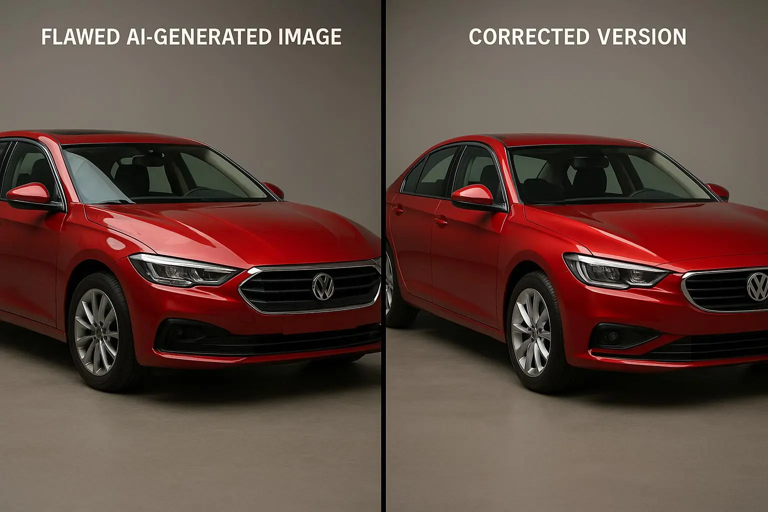
If you’re using VisionForge AI Studio (or any diffusion-based tool) to conjure scenes, you’ve probably hit that frustrating moment: the image looks great at a glance, but there’s something off a little closer—melting hands, weird lighting, colors that don’t match the prompt, or a composition that feels right in concept but wrong in detail. I’ve been there. I’ve watched a single prompt yield a beautiful idea and a messy result, and I’ve spent hours chasing the missing piece. This isn’t just about knowing the knobs to twist; it’s about a runnable debugging process you can rely on when the creative clock is ticking.
Today I’m walking you through a practical, human approach to identify and fix these gaps. I’ll share a real story from my own work, the micro-moments that stuck with me, and a workflow you can apply to your own projects without turning debugging into a full-time job. You’ll see how to separate two big problems—artifacts and semantic drift—and how to stitch your prompt, settings, and post-processing into a tight loop that actually produces repeatable results.
And yes, this is hands-on. Not theory. Not buzzwords. Just a clear path from “this looks cool” to “this is publishable-quality AI art.” If you’re in the middle of a project and you need a reliable way to push past the quality gaps, this is for you.
A quick moment before we dive in: I’ve learned to treat each image as a tiny engineering project. You don’t just describe a scene—you specify constraints, measure outcomes, and iterate. That mindset is what keeps your art moving forward, especially when the results start to drift.
Before we get into the meat, here’s a micro-moment that stuck with me recently. While I was testing a knight-in-armor prompt, the composition sang. The armor was crisp, the pose was solid, and I could practically hear the clink of chainmail. The problem was the sword. It looked like melted plastic and, worse, the knight had three extra fingers peeking from the gauntlet. It felt like the model was confidently ignoring the most delicate details right at the moment those details mattered most. That moment reminded me: focus on the crispness of the target detail, not just the overall vibe. That single detail was my cue to build a more surgical, artifact-aware workflow, which is exactly what I’ll share next.
How I frame the problem: artifacts vs. semantic drift
There are two broad families of quality gaps you’ll encounter with VisionForge AI Studio:
- Artifacts and low local coherence: distorted anatomy, missing fingers, odd textures, blurry patches, or strange geometries that feel like the model gave up on the fine-grained details.
- Semantic drift and color/style mismatches: the image conveys the wrong color palette, the wrong era or style, or misinterprets a key concept from your prompt.
Understanding the distinction helps you decide where to start. When artifacts dominate, your fix usually lives in prompts, seeds, CFG weighting, and inpainting. When semantic drift rules the scene, you need to tighten constraints, adjust token weights, and sometimes bring post-processing into the loop.
Here’s what I’ve learned from real-world use:
- Artifacts tend to cluster around object boundaries and human anatomy. The model handles the big shapes but trips over small, connected features (hands, faces, fingers, gear). This is a problem of local coherence, not global scene understanding. Good prompts can still mislead the model if you push it into a high-detail, low-frequency problem space.
- Semantic drift often shows up through color mismatches and inconsistent lighting. When you tell the model “crimson and gold,” you’re negotiating a lattice of colors and textures that the model translates via statistical patterns. If your prompt stacks too many conflicting cues, the model grinds to a compromise that meets none of them exactly.
I’ve made a lot of mistakes here. A particularly painful one was trying to push a “photorealistic medieval knight” prompt into hyper-detailed armor and a legendary sword, while also calling for “cinematic lighting.” The image came back with a perfect silhouette, but the sword looked like a toy, and the lighting warped the metal into orange plastic. It took a few cycles to realize I’d overconstrained the scene with conflicting cues. The fix wasn’t to rewrite the story; it was to de-risk the prompt by separating the big, global decisions from the micro-level details I needed crystal clarity on.
That experience taught me a simple truth: start by isolating the unstable parts. If the sword’s material is unstable, address it in a focused pass (negative prompts or precise prompts about material), not in a big, sweeping rewrite of the scene.
Section 1: The anatomy of AI artifacts (The technical gaps)
Artifacts are the stubborn, loud troublemakers. They say, “I know what you asked for, but I’m not going to do it.” Here are the common culprits I see most often.
- Distorted limbs and extra digits: hands are tiny precision targets. When prompts include complex poses or accessories, the model sometimes renders extra fingers, misshapen knuckles, or awkward joint angles.
- Texture glitches and blotchy patches: large flat planes (like armor plates or fabric surfaces) can become blotchy instead of smooth, especially when the aliasing hits at the boundaries.
- Blurry faces or eyes: faces are highly sensitive to prompts. Even if the body looks right, a blurry face can kill the overall impression.
- Structural misalignment: the relationship between objects in the scene goes off. A knight’s shield, a sword’s angle, or a horse’s neck position might be misrepresented, breaking the sense of physical plausibility.
I remember a specific session where I was chasing a “knight in shining armor” concept. The body and armor looked great, but the sword’s blade kept shimmering into a misaligned geometry at the tip. It wasn’t just a bug in the rendering; it was a hint that I needed to simplify the tool’s workload in that area. I started with a more constrained prompt: the sword should be a standard, straight-edged steel blade with a simple cross-guard. The result was cleaner and more stable. Then I introduced a separate pass to elevate the blade’s detail using targeted inpainting. The final piece felt cohesive without being computationally brittle.
A practical, repeatable workflow to tackle artifacts
- Step 1: Regenerate with a tighter seed, or keep the seed if the composition holds but the details fail. This helps you preserve the global structure while chasing local coherence.
- Step 2: Add negative prompts for the trouble areas. If hands are your issue, inject terms like “deformed hands, extra fingers” into the negative prompt. If textures are failing, name the textures to avoid (e.g., “low-res texture, blurry surface”).
- Step 3: Tweak CFG scale and sampling. A higher CFG makes the image adhere to the prompt more strictly, sometimes at the cost of coherence. A lower CFG invites creativity but can invite drift. Small steps—1 point at a time—usually do the job.
- Step 4: Consider inpainting for localized fixes. If a single finger or a patch near the shoulder is off, inpainting is your surgical instrument. Don’t waste time re-rendering the entire image for a minor flaw.
The negative-prompting approach isn’t just a hack. It’s a structured way to tell the model what not to do, which is often more effective than trying to hammer in every positive detail. It’s also something you can codify—keep a small list of recurring problem terms and refine it as you go.
A note on upscaling artifacts: sometimes the base image is clean, but upscaling introduces a new kind of trouble. The textures become too aggressive, surfaces pick up cross-hatching, or the noise pattern becomes distracting. That’s a separate decision point: work with a high-quality upscaler, use internal upscaling settings when available (the “High-Resolution” pass), and test with a lower CFG for the upscaled pass to reduce artifact amplification.
A quick anecdote from a recent project: I built a three-panel landscape with a distant castle. The first panel’s rock textures looked brilliant in 512x512, but the 4K upscale turned the stone into burlap-like patterns. I traced the issue to the upscaler’s naively applied texture synthesis. I swapped in a different upscaler with stronger texture preservation, ran a light denoise pass, and adjusted the noise reduction. The third panel’s rock faces finally matched the first panel’s quality. It wasn’t magic; it was a disciplined approach to checking tools and settings at every stage.
Section 2: Prompt alignment and semantic drift (The conceptual gaps)
Semantic drift is the cousin of miscommunication. You think you’ve told the model something clearly, and the result suggests the model interpreted your words through a different lens. Here’s what helps when this happens.
- Break prompts into layers: global description, key objects, and style cues. Treat them as separate constraints so the model can optimize for each layer without balancing conflicting signals at once.
- Weight the most critical elements. If color matters, you need stronger cues around color than around texture. If pose matters, give the pose a tighter constraint than background details.
- Use consistent prompts for repeated elements. If you’re rendering multiple characters, a shared descriptor prevents drift across individuals.
- Test with minimal, clean prompts first, then progressively reintroduce complexity. This is the opposite of “let’s bolt everything on and see what happens”—it’s a surgical approach that minimizes the opportunity for drift to slip in.
Let me share a concrete example from a recent project. I wanted a photorealistic portrait of a scientist in a lab, with blue lighting and silver goggles. I started with a minimal prompt: “photorealistic portrait of a scientist in a lab with blue lighting.” It looked good, but the lab’s equipment started to drift away from reality—the glassware looked oversized, and the goggles ended up reflecting the wrong kind of light. I then layered in a focused constraint: “goggles with a matte titanium finish, correct chem lab glassware proportions, blue gel lighting.” Finally, I added a tiny prompt for skin tones and lab coat texture. The final image kept the global feel while the micro-details aligned to the lab environment. It was a small change that had a big impact.
A 30-60 second aside that stuck with me: when I’m chasing semantic precision, I often keep a tiny checklist open on my desk. If a detail doesn’t feel right, I ask: does this belong in the global concept, or in a micro-level constraint? If it doesn’t clearly belong to one of those buckets, it’s likely to drift.
Practical prompts for reducing drift
- Use explicit material and finish language: “steel, brushed finish, matte reflection.”
- Specify lighting and color harmony: “cool blue key light, warm fill, color-balanced shadows.”
- Anchor pose and composition separately: “three-quarter view, weight on the left leg, sword at 45-degree angle.”
A quick note on token weighting: the problem isn’t that bigger prompts are always wrong; it’s that too many strong signals can cancel each other out. If you’re seeing drift, try reducing the number of conflicting prompts and give each a clear, distinct target.
Section 3: The iterative refinement loop: a practical troubleshooting workflow
The heart of good AI imagery is a repeatable loop you’re happy to run again and again. Here’s a lean, practical workflow I actually follow.
- Step 0: Define success. Before generating, write down one or two non-negotiables (e.g., “hands must have correct number of fingers,” “armor must reflect ambient light accurately”). If you can’t articulate it, you don’t know what to fix.
- Step 1: Generate with a focused seed and constrained prompt first. If the result is close but not right, keep the seed. If it’s off structurally, switch seeds.
- Step 2: Run a quick artifact audit. Look for warped shapes, extra digits, blur, and texture oddities. If you spot one, pop it into a negative-prompt pass and adjust your CFG to tighten or loosen guidance.
- Step 3: Tweak prompts in small increments. Add or remove a single constraint at a time. Your brain will thank you when you’re not juggling twenty variables.
- Step 4: If the result is semantically close but off in detail, separate the problem: keep the broad concept, rewrite the micro prompts for the tricky parts, and re-run the pass.
- Step 5: Use targeted inpainting for stubborn localized flaws. If a single patch is off, don’t re-render the whole thing. Mask the area and guide the regeneration with a precise prompt.
- Step 6: Validate with a quick upscaling test. If artifact amplification happens after upscaling, switch to a different upscaler or dial down the upscaling strength and re-apply the fix at the base resolution.
A personal example from a recent run helped crystallize this loop. I’d created a dramatic fantasy scene with a towering mage, but the mage’s cape carried a strange, wavering texture that suggested a drift in the cloth’s weave. I ran a lens check—tightened the prompt to emphasize “silky, detailed weave, matte finish, no shimmer.” Then I re-ran with a slightly different seed and added a focused negative prompt around “unwanted shimmer” in the garment. The cape’s texture settled into a crisp, believable weave. It wasn’t magic; it was a disciplined pass through the loop with a clearly defined success metric.
Micro-moments that matter when you’re debugging
- The first 10 seconds after a render reveal a lot. If you can pause to scan for the obvious mechanical failures (hands, texture seams, edge aliasing), you’ll save hours later.
- A small change in lighting direction often rescales the perceived fidelity of metal and skin. Don’t underestimate the power of a lighting tweak.
- If you’re stuck, walk away for 5-10 minutes and come back with fresh eyes. Sometimes a fresh look makes a hidden artifact obvious.
Section 4: Addressing upscaling and post-processing pitfalls
Upscaling is a double-edged sword. It can reveal clean base imagery or magnify subtle artifacts into a loud flaw. Here are guardrails I use to keep upscaling from destroying the work.
- Start with a clean base: ensure the 1024x1024 base image is solid before upscaling. If there are any unresolved issues, fix them before you scale.
- Pick your upscaler carefully. Some tools introduce textures you don’t want (cross-hatching, noise amplification). If the standard upscaler adds noise, switch to a more faithful one or apply noise-reduction pre- and post-upscale.
- Use a progressive upscaling approach. Upscale in small steps with intermediate checks. If a step reveals new artifacts, pause and address them in the base pass rather than hoping the upscaler will fix it.
- Consider inpainting after upscaling. If an artifact pops up in a tight area after scaling, inpaint that region rather than re-rendering the whole image.
In practice, I often run VisionForge’s internal High-Resolution pass first, then decide if I need a third-party upscaler for the final 4K deliverable. The decision hinges on texture integrity and color fidelity after the initial pass. The goal is to keep the character and composition intact while sharpening the final surface details.
Section 5: Creative workflow and ethics: when to push and when to pause
Debugging AI imagery isn’t just a technical exercise. It’s also a creative discipline. You want to honor your vision while respecting the tool’s limitations. Here’s how I balance push and pause:
- Push when you’re refining a concept that’s almost there. The incremental adjustments are the difference between an ok render and a strong one. It’s a feeling of making something with your own hands, not just pressing a button.
- Pause when you’re chasing perfection that isn’t feasible in your constraints. If you’re fighting a drift that won’t settle without overfitting or overfitting to a single seed, step back and simplify.
- Respect the model’s limits, but don’t bias against your own artistry. Use negative prompts and fine-grained prompt weighting to express what you don’t want as clearly as what you do want.
I’ve also found it helpful to maintain a “decision log.” Every time I choose to reframe a prompt, adjust CFG, or change the seed, I note why. Over time, you’ll build a personal playbook you can reuse across projects.
A quick real-life example: I was producing a sci-fi cityscape series and kept hitting repeated color mismatches—the neon blues kept veering toward teal, no matter how I tweaked the prompt. I started logging my steps: seed 4271, CFG 8, added “crisp neon blue lighting,” swapped in a different upscaling method, and tested a slight shift in color temperature. The consistency started to emerge after several iterations, and I ended up with a cohesive set of images that shared a common palette and vibe.
How to implement this today: a compact, repeatable routine
- Define three must-haves for your scene (pose, primary color palette, lighting).
- Build a two-layer prompt: one for the broad concept, one for the tricky details.
- Start with a stable seed; if the artifact shows up again, switch seeds.
- Apply negative prompts for persistent artifacts and test incrementally.
- Use inpainting for localized fixes; don’t re-render the whole image for minor flaws.
- Validate your result at base resolution, then upscale with a guardrail (check textures, seams, and color fidelity).
- Maintain a brief decision log to capture what worked and what didn’t, so your next project doesn’t start from scratch.
If you want an even tighter workflow, here’s a quick template you can drop into your next session:
- Prompt baseline: “photorealistic portrait of [subject], [scene], [lighting], [color palette].”
- Add constraints for critical details: “hands clearly formed, no extra digits, precise fabric weave, correct alloy finish.”
- Negative prompts: “deformed hands, extra fingers, blur, noise, watermark, distortion.”
- CFG range: start at 7, adjust up or down by 1-2 in small increments.
- Seed strategy: try your baseline seed; if issues persist in a targeted area, switch seeds and re-run with focused adjustments.
- Post-processing: use inpainting to fix small defects, then consider a light color correction pass.
Final thoughts: debugging as a creative craft
What I’ve learned over countless sessions is simple: you don’t fix AI art by heroic brute force. You fix it by disciplined, repeatable refinement. Art is messy in the short term, and good AI art is a result of patient, methodical work that respects the tool while stubbornly pursuing your vision.
If you adopt this approach, you’ll see two things quickly. First, your artifacts will become far less stubborn. The images will hold together at larger scales, and the details you care about—hands, textures, lighting—will behave more predictably. Second, you’ll regain momentum. Debugging becomes less of a sink and more of a normal part of your creative routine.
I write this not as a badge of expertise but as a map I wish I’d had when I started. The road to “sellable” AI art isn’t about mystical insight; it’s about building a reliable toolkit, one session at a time. You bring the intent; VisionForge can bring the imagery. The trick is learning to talk to the tool in a language it understands—and then translating the outcome back into what you meant to create in the first place.