Troubleshooting AI Image Pitfalls in the Real World
Nov 22, 2026 • 9 min
If you’re generating images for marketing, a presentation, or a quick social post, you’ve probably run into the same three problems again and again: hallucinated details, style drift, and licensing headaches. It feels like you’re fighting an invisible friend who keeps mishearing your prompts and changing the vibe mid-sentence. I’ve been there.
In this post, I’m not selling you a magic wand. I’m sharing what actually worked for me, with concrete tweaks you can try today. No buzzword bingo, just practical guardrails that make AI outputs more predictable and usable.
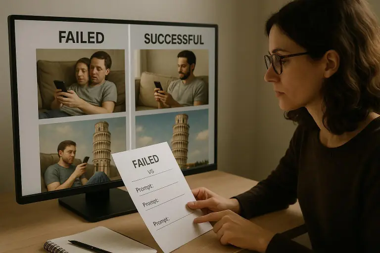
A quick micro-moment I learned along the way: early on, I trusted a single generation for a campaign. It looked perfect in the tool, then failed utterly in a client presentation because the lighting and the scale of objects didn’t match the copy. It wasn’t a failure of the tool—it was a mismatch between the prompt, the reference visuals I was pulling from, and the end-use context. That little mismatch taught me to test visuals in the exact context they’ll be viewed, not in isolation.
And speaking of context, here’s a real story from my own work to show you what actually happens when you fix these issues instead of hoping for the best.
A real-world story A few months ago, I was building a visual library for a fintech client who wanted “trustworthy, human, and approachable” imagery to accompany blog posts about budgeting and savings. I had access to several top-tier AI image generators, and I poured prompts into each one, tweaking colors, composition, and facial expressions. The first pass looked great in the generator, but when I pulled it into the site, two problems showed up. First, a character wore a badge that suggested they were an employee of a bank’s competitor—an obvious misalignment with the client’s brand. Second, the lighting in the image changed across scenes, making the set feel inconsistent as readers scrolled.
What I changed was simple but powerful. I started with a strict guardrail: one “trust” frame (a close-up of a smiling, approachable face) and one “context frame” (a desk with a financial calculator and papers). I added a negative prompt to exclude “hard logos nor any bank insignia,” and I uploaded a quick brand reference image to lock in color temperature and lighting style. The result wasn’t perfect after one pass, but I iterated with one or two more prompts, keeping the same seed value to preserve overall cohesion. The final set felt cohesive across a campaign, and none of the images contained the unintended branding glitch I saw in the initial pass. The client was happy, and I saved hours that would have gone into manual image edits.
That experience taught me to treat AI-generated visuals like any other creative asset: you don’t just generate once and call it a day. You test in the exact usage context, you constrain the output with clear guardrails, and you validate against real-world needs (dimensions, licensing, editorial cues). A tiny extra detail that stuck with me: I learned to lock a color palette in the prompt and in the reference images. It’s a small thing, but it dramatically reduces the “drift” you see across images in a series.
Now, let’s get into the three big pitfall families and how I actually fixed them on live projects.
How I actually made this work
If you want reliable AI visuals, you’ve got to be intentional about prompts, prompts, and guardrails. Here’s the structure I’ve settled on after hundreds of renders and a couple of agency-fire drills.
Hallucinations: when details wander off the page
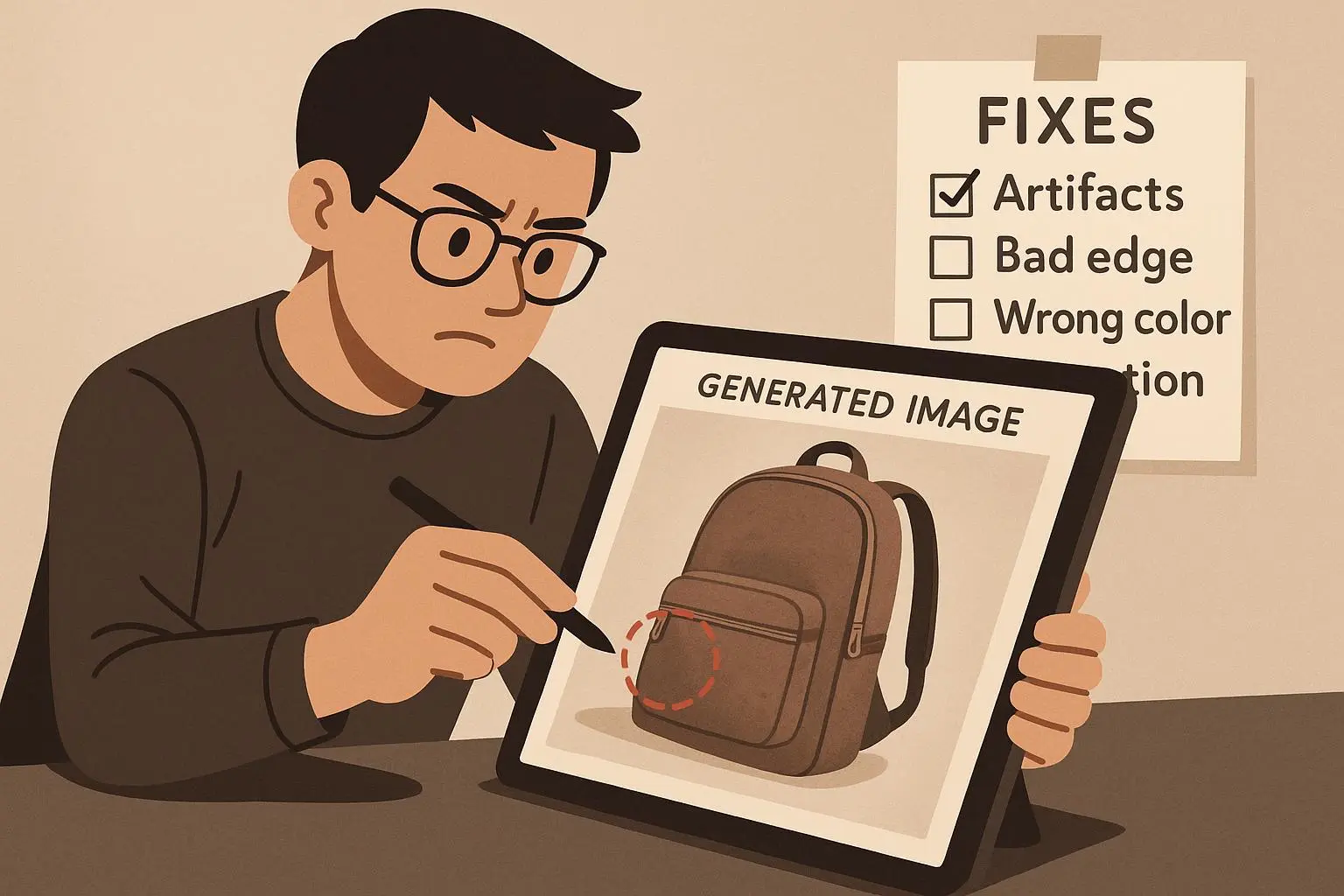
Hallucinations are the most common frustration. The AI will tell you something plausible that isn’t true to your brief, and suddenly you’ve got extra limbs, wrong objects, or a hidden watermark you didn’t ask for. The fix is not about chasing “more realism” but about constraining the problem so the model isn’t guessing in the dark.
- Be specific with the core object and its environment. If you want “a red sports car on a city street at dusk,” add exacts: model year, visible license plate style, street type, number of pedestrians, street lamps, and the exact time of day.
- Use negative prompts. Explicitly tell the model what to avoid: “no extra limbs, no pedestrians with umbrellas, no logos or branding that isn’t on the brief.”
- Add hard references. Upload a reference image that captures the exact look and lighting you want. If you’re going for a cinematic feel, reference the lighting setup you want (key light height, fill, backlight) in your prompt.
- Lock the seed value when you’re building a series. If you want consistent structure, use the same seed to create variations of the same scene. This reduces drift from one image to the next.
- Iteration is your friend. Generate a few options, then pick the elements you like best and re-combine prompts to keep what works.
Micro-moment aside: a tiny change in wording can save you from a cascade of wrong details. I once swapped “car” for “vehicle” and added “red, with a glossy finish,” which nudged the AI away from producing a matte, oddly textured hull that didn’t match the brand.
Real-world example: I was creating a set of product photography-style images for a gadget launch. The prompt kept spitting out a “camera” next to the product instead of a clean product shot. I added an explicit constraint: “no extraneous cameras, no reflections that obscure the product, plain white studio backdrop.” I also fed a reference image of a clean white product shot to anchor the lighting and composition. Result: fewer stray elements, more consistent framing, and a usable batch that matched the client’s catalog.
What I learned here: you don’t get reliability from vibes. You get it from precise prompts, guardrails, and test runs tied to the exact end-use.
Style drift: staying on brand across a set
Style drift is the quiet killer of campaigns. One image in a series ends up photoreal, the next looks like a watercolor map, and suddenly your “brand look” evaporates.
- Decide on a single, explicit style word or mood. Whether you want photorealistic, painterly, flat vector, or cinematic, state it clearly and stick to it.
- Use style references. Many tools let you upload a reference image that guides texture, line weight, and color treatment. If your brand uses a specific light quality, reference it.
- Control lighting and color in a consistent way. Specify a target color temperature (e.g., 5200K) and a palette reference (teal/peach, etc.). If possible, keep a single shot with controlled lighting as a “style sheet” for the entire batch.
- Seed and macro prompts for consistency. Keep a stable seed across the series and reuse the same macro prompts for layout and composition.
30-60 second aside: early on I tried a “soft cinematic” feel across a dozen variants. The results looked great individually, but as a set they clashed—one image felt noir, the next felt bright and airy. I realized I’d let the prompt carry too much interpretation. By locking the lighting, camera angle, and color bias to a shared sheet, the set finally looked like it belonged together.
Real-world example: for a vegan-food brand, I wanted a consistent clean-plate aesthetic across a blog series. I used a shared seed, a single style tag (photorealistic with natural light), and a color anchor (muted greens and warm earth tones). I uploaded a reference shot of a plate in a real restaurant setting and used it as a guide for texture and shadow. The result was a coherent set: images that felt created by the same “look,” not a random collection of random renders.
What I learned here: style is a contract. If you want consistency, codify it in the prompts and in your references from day one.
Licensing and copyright: staying on the right side of the law
Licensing isn’t a sexy feature. It’s the boring, essential thing that lets you sleep at night after you publish something. The legal landscape around AI-generated images is still evolving, and a lot of the confusion comes from unclear ownership and usage rights.
- Read the terms of service. The policy for commercial use varies by tool. Some platforms grant broader rights than others. You want explicit commercial rights if you’re publishing or selling the visuals.
- Favor tools with clear licensing. If you’re building a campaign you’ll reuse, you want an asset license that covers re-distribution and adaptation.
- Avoid prompting for protected content. Don’t name living people, real brands, or copyrighted characters in prompts if you’re not certain about resulting rights. The bigger risk is creating something that resembles a protected work too closely.
- Keep a record. Save the prompt, seed, tool, and license terms for each asset. This isn’t glamorous, but it saves you from a mountain of “how do I prove I had rights to this?” questions later.
- When in doubt, talk to a lawyer. IP is a risk area for AI-generated work, and a quick check with a professional can save you trouble down the road.
A quick micro-note here: licensing is a moving target. The “best practice” today might shift next quarter as court rulings and platform policies evolve. Build flexibility into your workflow so you can adapt without throwing a whole project into doubt.
Stories from the field always help here. I’ve had clients push back on stock-like visuals when the tool used a lot of recognizable styles. The fix wasn’t to stop using AI; it was to confirm licensing for derivatives and to choose tools offering clear commercial rights. In one case, we swapped to a platform that provided a clean commercial license and avoided the headaches of negotiating permissions individually for every asset.
A practical workflow you can actually use
Here’s a lean, repeatable flow I’ve found saves time and reduces risk. It’s not fancy; it’s just the parts I keep in a single sprint.
- Step 1: Define the brief in one sentence. What’s the exact emotion, use-context, and required elements? If you can’t say it in one sentence, you don’t have enough clarity yet.
- Step 2: Pick one core style and lock it in. Decide photorealistic, painterly, or clean vector, and keep it consistent.
- Step 3: Build a constraint package. List exact objects, environment, lighting, color palette, and bad elements to avoid. Include a short negative prompts block.
- Step 4: Generate 3-5 options with the same seed. Pick the best and note why you chose it.
- Step 5: Refine with a single prompt tweak. Tweak one variable at a time (lighting, color, composition). Don’t try to fix everything at once.
- Step 6: Reference-check against the usage scenario. Drop the image into the real page where it’ll live. Does it pass the size, font, and copy around it? If not, adjust.
- Step 7: Confirm licensing. Save the tool, license, terms, and a quick note on what’s allowed with this asset.
- Step 8: Document. Save prompts, seeds, and licenses in a project sheet. You’ll thank yourself later.
One more practical tip I use often: keep a “style sheet” in your notes. It’s a single page with the style decisions (tone, lighting, color palette, reference images) that you copy-paste into prompts for every new asset in the series. It’s boring, but it pays off when a client asks for a re-run or an extension to the campaign.
What to do when things still go wrong
No system is perfect, and AI isn’t magic. When you hit trouble, you’ve got a few arrows in your quiver.
- Re-check the end-use context. If your image looks right in a generator but off in the real page, you’ve probably got a mismatch in aspect ratio, composition, or typography.
- Simplify the brief. If you’re chasing a lot of elements at once, the model will drift. Strip the prompt to the core elements and then reintroduce complexity in controlled steps.
- Double down on references. A single well-chosen reference image can anchor style and lighting in a way a long prompt can’t.
- Create a governance rule. If a client demands a series, mandate at least two rounds of QA from a real human (not just the tool’s preview). It’s easier to approve a few well-vetted assets than to fix a whole campaign after launch.
If you’re in creative leadership, consider adding a “CYA pass” to your process—one extra review specifically focused on licensing, brand alignment, and end-use rights. It’s a small step that prevents big headaches.
The takeaway: kind rules beat clever prompts
What changed for me isn’t a single trick. It’s a mindset shift: treat AI image generation like you would any other asset-creation process, with guardrails, QA, and a clear use-case context. The technology will likely keep changing, so the right habits matter more than the exact tool you’re using this quarter.
- Hallucinations aren’t just “quirks.” They’re a signal to tighten prompts, add negative constraints, and anchor visuals with references.
- Style drift isn’t a noble aesthetic. It’s a reliability problem. One consistent prompt, one consistent reference, one seed, and one brand color story make a huge difference.
- Licensing isn’t optional. It’s a risk-management practice. Know the license, document it, and choose tools with clear rights if you’re doing commercial work.
If you want to see this in action, start with a small project: one page, two or three visuals, a single style, and a tight set of licensing terms. If you nail that, you’ve got a blueprint you can scale.