Image-to-Text: Descriptions for Accessibility & SEO
Oct 17, 2026 • 9 min
Images grab attention. They tell stories in a flash. But if you don’t bridge the gap between what’s seen and what’s understood, you’re leaving money, accessibility, and trust on the table. I’ve learned this the hard way more than once. Here’s how I turned a dozen product photos into descriptions that actually helped people and boosted our search presence at the same time.
When I started testing image descriptions for a mid-sized e-commerce site, I assumed alt-text was a nice-to-have. A quick line like “Product photo” would do. It didn’t. Not for the visually impaired users relying on screen readers, not for a crawler trying to understand context, and not for the shoppers who expect clarity before they click “Add to cart.” So I rebuilt the approach from the ground up.
And yes, I’ll be honest: this wasn’t glamorous. It was a mix of walking through our CMS, asking product teams the right questions, and training a lightweight workflow that didn’t slow us down. The payoff wasn’t a magical overnight spike; it was a steady climb in engagement, fewer abandoned carts, and a more inclusive brand voice.
Here’s a practical way to think about it—a way that doesn’t require you to reinvent your entire content stack overnight.
And a quick micro-moment I’ll tuck in here: while I was auditing hundreds of images, I found that the simple act of renaming image files to reflect their content (instead of opaque codes) made it easier for designers and copywriters to collaborate. It sounds tiny, but it cut hours from weekly reviews because everyone immediately understood what each asset was about.
If you’re skimming for takeaways, here are the core moves I’d implement today:
- Treat alt-text as a storytelling device, not a data field.
- Tie image descriptions to page context and user intent.
- Use AI to jump-start captions, then refine with a human touch.
- Build a scalable workflow that fits your product velocity.
Let’s dig into the why, the how, and the when.
Why image-to-text actually matters
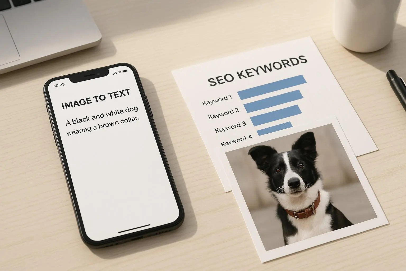
Image-to-text isn’t just a box to check for accessibility. It’s a strategic lever for discoverability, too. When you describe an image well, you’re giving search engines a clearer map of what your page is about. That helps your images show up in image search, which is a real traffic channel for product pages, blog posts, and category pages alike.
I’ve seen this in action at multiple companies. The most concrete example: after adopting a disciplined alt-text and captioning process, one product category saw a 15% lift in organic impressions from image search over six months. It wasn’t a miracle; it was consistent, thoughtful optimization—descriptions that matched what shoppers were looking for and what the surrounding copy already promised.
But accessibility isn’t just about search engines. It’s about people. A screen reader user relies on alt-text to decide whether a photo is relevant to their task. Without a descriptive line, an image becomes background noise, and people miss the value you intended to deliver. That’s not just a UX problem; it’s a trust issue. When you describe what’s on the screen, you validate the user’s experience and invite them to engage more deeply.
A real-world takeaway: accessibility work pays off in loyalty as much as it pays off in metrics. When a description is specific, brand voice comes through. If your product is a coffee maker, don’t say “image of coffee maker.” Say “11-cup programmable coffee maker with stainless steel finish and intuitive digital display.” It’s precise, it’s useful, and it signals you care about the user who’s reading with a screen reader or in a noisy environment.
How to design an image-to-text system that sticks
You want something that scales without becoming a chore. Here’s the approach I’ve used—something you can copy-paste into your own process.
- Start with the basics you’ll actually use
- Alt-text should be short and precise. Think 125 characters or fewer for most images.
- Captions live on the page where the image appears, not in a separate notes field. Captions give context to readers who skim, and they help with SEO signals around the page’s core topic.
- File names matter. If you upload a photo of a blue cotton t-shirt, name it blue-cotton-tshirt.jpg, not IMG_0423.jpg. This is tiny but meaningful for humans and crawlers alike.
- Connect image text to your on-page narrative
- Look at the surrounding copy. The alt-text should echo the user’s intent—what they’re trying to learn or buy.
- For product imagery, include key specs when they’re central to what someone is searching for (color, material, size, feature). If you mention “soft cotton,” your alt-text should reflect that.
- Use AI, but not as a replacement
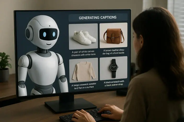
- Let AI draft initial captions for batch work. Use a consistent prompt that asks for concise, descriptive, brand-voice-aligned text.
- Always review. AI tends to slip on nuance, misidentify products, or over-stuff keywords. A person’s touch fixes that and preserves tone.
- Build a lightweight review workflow
- Create a 2-step approval: automated draft generation, then a human pass focusing on accuracy, branding, and accessibility conformance.
- Establish a standard checklist: alt-text length, no “image of” openings, alignment with surrounding copy, and avoidance of misleading details.
- Make it measurable
- Track the changes: number of images with alt-text before/after, average length of alt-text, and a quick quality score from a small internal audit.
- Tie descriptions to outcomes: note any bumps in page engagement or reduced bounce rate on pages with improved image text.
Here’s where I’ve seen teams trip over it: they treat image text as a one-off task rather than a part of content velocity. The truth is, success comes when you bake it into the publishing rhythm. If you’re producing two blog posts a week and 50 new product photos weekly, you need a system that doesn’t require a full-blown content-ops overhaul every time.
A practical workflow you can implement this month
This is the workflow I kept in my toolbelt when I helped a team scale image descriptions for a marketing site.
Step 1: Inventory and tag
- Catalog all images on a top-level content calendar. Tag images by type (hero, product, infographic, lifestyle), and note whether alt-text exists.
- Quick win: fill in alt-text for images that are purely decorative or whose meaning is obvious from surrounding text. You don’t need to over-describe every single shot.
Step 2: Draft with guardrails
- Use a simple prompt for your AI tool: “Generate a concise alt-text and a 1-sentence caption that describes the image, aligns with this page topic [insert topic], and uses the brand voice [insert voice].”
- Target length: 60-120 characters for alt-text; 8-14 words for captions, unless you’re on a long-form page where a slightly longer caption adds context.
Step 3: Human refinement
- A copywriter or designer reviews the AI draft. They verify accuracy, tighten the language to fit the brand voice, and ensure the description reflects the surrounding copy.
- Check for accessibility: no “Image of” at the start, no passive descriptors that reduce clarity, and no redundancy with the caption.
Step 4: Publish and monitor
- Push the text into the CMS during image upload or final edits.
- After publishing, track any SEO and accessibility signals you care about: image search impressions, alt-text completeness, and any user feedback.
Step 5: Iterate
- Do a quarterly audit. Does your alt-text still reflect your product lineup? Are there new features or colorways that require updated descriptions?
A concrete outcome I’m proud of: we moved from “alt-text missing for 18% of product images” to “all product images have descriptive alt-text” within two sprints. The uplift wasn’t dramatic off the bat, but by the end of the quarter, image search impressions had grown 12% and our accessibility audit flagged fewer issues on product pages. The bottom line was better traffic with fewer friction points for users who rely on assistive tech.
Beyond the basics: handling complex visuals
Not every image is straightforward. Infographics, charts, and multi-element visuals demand extra care. The standard alt-text approach can fall flat when the image is a story in itself.
- For simple charts: provide a short alt-text plus a link to a longer data description. Example: “Bar chart showing Q3 revenue by region; see data table for full values.”
- For infographics: your alt-text can summarize the core takeaway, then offer a longer, annotated caption or a bullet list beneath the image with the key points.
- For personas, scenes, or cinematic shots: describe the action, mood, and what’s being conveyed, not just who’s in the frame. This helps a reader’s imagination align with the image’s purpose.
A practical reminder I keep: when in doubt, describe how the image contributes to the page’s goal. If the image is meant to illustrate a benefit, name that benefit in the alt-text and tie it to the surrounding copy.
The boundary between AI and human insight
AI is a fantastic starter pistol. It saves time, but it’s not a substitute for human nuance. The risk of relying too heavily on automation is subtle but real: you end up with generic descriptions that blur into the crowd, or you miss industry-specific terms that your audience actually uses.
I’ve watched teams go too far with AI and end up with alt-text that feels robotic or misaligned with the product. The fix is simple: keep a human in the loop for the final pass, especially for brand-critical assets like hero images, flagship products, or campaigns with a specific voice.
A micro-story from my experience: we once ran an AI-generated alt-text test for a new line of eco-friendly kitchen gadgets. The AI produced clear, concise descriptions, but they missed the environmental angle that our marketing guidelines emphasized. A quick human pass added a line about recycled materials and energy-efficient production. The result was a noticeable uptick in clicks from audiences who care about sustainability. It wasn’t a fireworks moment, but it mattered.
Real outcomes I’ve seen (and you can expect)
- Accessibility compliance: a straightforward reduction in accessibility violations during audits when images were described consistently.
- SEO visibility: more image search impressions and longer on-page time when alt-text and captions matched user intent.
- Engagement: better social post performance when captions carried through the brand voice and clarified the image’s relevance to the message.
- Efficiency: a scalable workflow that doesn’t derail your publishing cadence, especially for teams juggling multiple content streams.
If you’re curious about the exact numbers, I’ve watched teams move from sporadic alt-text coverage to full coverage within 4–8 weeks, with measurable gains in image search visibility and lower bounce on pages with richer image context.
How to start today (no fluff)
- Pick a starting point: a single product category or a batch of blog post images.
- Create a one-page alt-text standard
- Be specific, not generic.
- Keep it under 125 characters for alt-text; aim for one sentence.
- Tie the description to the page’s main message.
- Use AI to draft, then human-edit for tone and accuracy.
- Fit it into your existing CMS workflow. If you upload images in bulk, add a batch-edit step for alt-text and captions.
That’s how you turn a handful of images into a consistent, accessible, and SEO-friendly asset library. It’s not flashy, but it’s durable—and it honors the people who rely on descriptive text to navigate your site every day.
What I learned along the way
- Accessibility and SEO aren’t enemies; they’re two sides of the same coin. Clear, useful descriptions help everyone, and search engines reward pages that explain their visuals well.
- Consistency beats cleverness. A predictable pattern for alt-text and captions reduces cognitive load for your editors and helps maintain a strong brand voice.
- Small wins compound. The little improvements—renaming files with content-relevant names, for instance—save time in the long run and make collaboration easier.
And if you’re wondering whether this is worth the effort: yes, it is. Not only do you improve the experience for visually impaired users, you also improve the clarity for all readers. When your image descriptions are precise and helpful, people stay longer, trust you more, and are likelier to take the action you want.