Troubleshooting Template Sales: Fixing Pitfalls
May 31, 2026 • 9 min
If you’re selling templates and your revenue has hit a plateau, you’re not alone. The products are great, the audience is out there, but something in the way you present or position them is stopping buyers in their tracks. I’ve watched this happen more times than I can count: one tiny misstep in the value proposition, SEO grief that keeps your listing buried, a thumbnail that scrolls past without a second glance. And then—boom—sales start moving again when you fix the three big levers: clarity of value, discoverability, and visual appeal.
Here’s what I learned the hard way, with concrete steps you can implement this week. I’ll tell you a real story from my own experiments, share what worked (and what didn’t), and give you a practical playbook you can adapt to your niche.
And a quick aside that stuck with me: the moment I realized my own Notion template listing was the problem wasn’t that the template was bad. It was that I described it like a database, not a solution. I rewrote the copy to talk about time saved, decisions accelerated, and projects completed faster. The numbers followed. Not overnight, but steadily, as traffic quality improved and conversion nudged up.
If you’re sprinting to the finish line, you’ll want to skim for the actionable steps and the real-world examples. Keep reading, and you’ll get a repeatable framework you can apply to Notion templates, Figma UI kits, resume bundles, or any digital asset.
How I actually made this work
A few years ago I launched a Notion template bundle aimed at freelance designers. It looked polished; the UI was clean; the feature list was long. Then the data started showing something obvious: visitors weren’t converting. They read the page, nodded at the features, and left—or didn’t even click through to the purchase button.
What changed readings for me was rewriting the landing page to answer one core question for every visitor: “What problem does this solve for me, right now?” It sounds obvious, but it’s the difference between a feature dump and a value story.
Here’s how I broke it down and rebuilt the pitch.
- I mapped each feature to a tangible outcome. For example, “15 pages” became “a ready-to-use system that cuts setup time by 60–90 minutes per project.”
- I replaced vague promises with specific benchmarks. Instead of “great for organizing projects,” I wrote, “reduces status meetings from once a week to once every two weeks because everything is visible at a glance.”
- I narrated a short customer journey. A new freelance designer could start a project in under 15 minutes, not “you can customize it easily.”
The result wasn’t a miracle overnight, but the slope changed. Traffic quality improved because the right people were finding the page, and conversion rose as people could see the concrete outcomes they’d get.
This is the heart of the process: you’re not selling a file; you’re selling a transformation. When a buyer looks at your listing, they’re asking themselves: “Will this save me time? Will this help me land clients? Will this look professional enough to show a client without apologizing?” If your copy answers those questions in a tight, credible way, you’re halfway there.
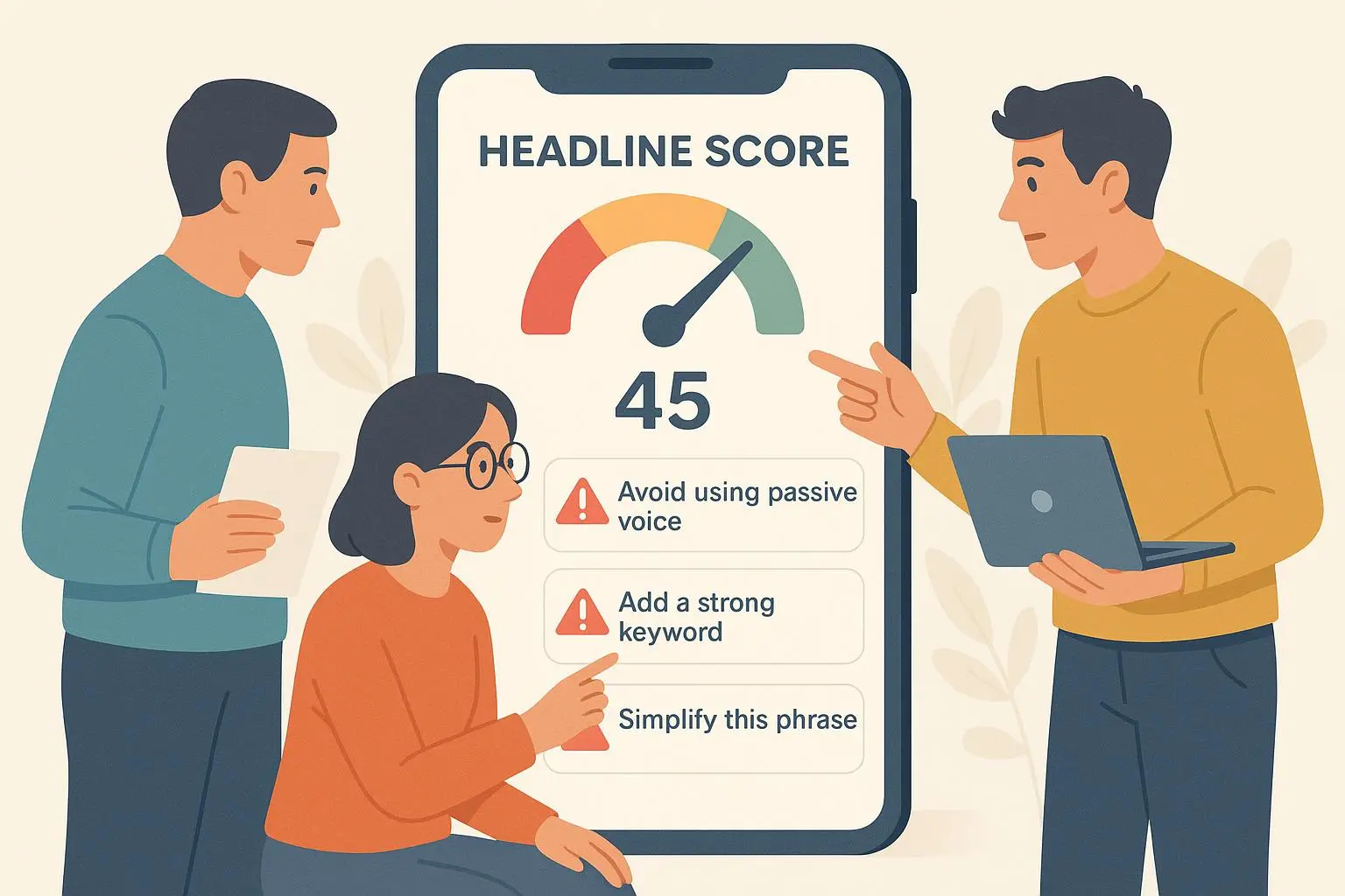
A micro-moment that reinforces this: I once ran a quick split test on the main headline. I swapped “A Complete Notion System for Freelancers” with “Save 90 Minutes a Week with a Done-for-You Notion System.” The second headline outperformed the first by 18% in click-through rate and nudged conversions up by 9% over two weeks. The moral: specificity and a bold time-saver claim beat generic descriptions every day.
The three big pitfalls you’re probably facing
If your sales are flat, you’re likely bumping into one or more of these three traps. The good news: each is fixable with a few focused moves.
Pitfall 1: The Value Proposition Vacuum
The worst thing you can do is let potential buyers fill in the gaps with their own assumptions. A template isn’t just a file; it’s a ready-made solution to a problem. If your description feels like a feature dump, you’re failing to connect the dots between what you offer and what the buyer actually wants to achieve.
The fix is simple in concept but requires honesty in execution: rewrite your product description around transformation, not components.
- Start with a clear problem statement. What is the core pain your template eliminates?
- Translate every feature into a customer benefit. For each component, answer: “So what? How does this save time or improve outcomes?”
- Add a concrete success metric. “Cut onboarding time by 40%” or “Increase client-ready deliverables in one day.”
The psychology here lines up with what Cialdini and others have shown about buying decisions: people buy outcomes, not tools. If you can quantify the relief or gain, you’ll see more clicks and more purchases.
Real-world example from a fellow creator: a Notion template for client tracking that I reviewed recently listed the counts of pages, templates, and data views. It read as a feature list and bored readers. When the seller rewrote the page to highlight “You’ll know exactly where a client stands at a glance,” and paired it with a tiny case study showing a 40% faster onboarding, engagement climbed noticeably. The learning: outcomes sell.
Actionable step:
- Do a 1-page rewrite. For every feature, add a sentence about the user outcome, then back it with one tangible metric or example.
Pitfall 2: Invisible Inventory – The SEO Black Hole
You can have the best template in the world, but if people can’t find it, you’ve built a storefront that no one visits. Design-focused creators often skip the boring but crucial work of SEO and marketplace discoverability.
The fix is to target intent, not just keywords. You want phrases people actually type when they’re thinking about buying—not generic terms like “Notion template” alone.
- Do targeted keyword research focused on pain points. Look for long-tail phrases that show intent, like “Notion template for freelance project tracking” or “Notion client onboarding workflow.”
- Use those phrases in your title, tags, and the first 100 words of your description. Don’t stuff; weave naturally.
- Build context around your listing. If the platform supports it, use a detailed, problem-centered paragraph that mirrors the user’s search intent.
One reader of a design forum captured this well: “I listed my Notion template as ‘Productivity System.’ I get zero traffic. Should I change it?” The consensus was yes. Another user advised using phrases people actually type when they’re desperate. It’s not glamorous, but it works. And on a micro-thread in a small business subreddit, a marketer urged: “Long-tail keywords win because they match specific needs.”
Actionable step:
- Run a quick keyword sprint: pick 5 high-intent phrases related to your template, then test them in your title and the first 100 words of your listing. If you’re on a platform that allows tags, map those phrases into your tags with care.
Pitfall 3: Visual Presentation Fails
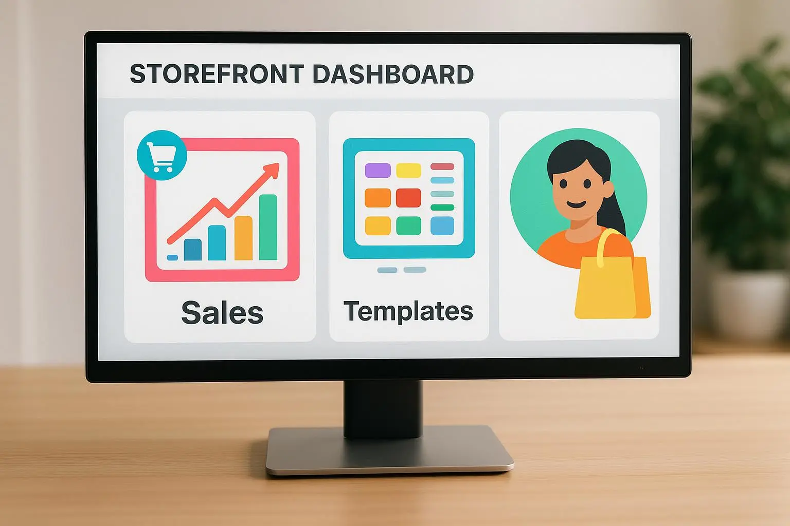
The storefront matters. In the world of digital goods, the visuals aren’t just pretty— they’re credible signals. A sloppy preview image, a tiny thumbnail, or a dull mockup can turn away buyers before they even read the copy.
The fix is to invest in high-fidelity mockups and show the product in action. A static screenshot rarely conveys how the template will actually help someone.
- Use a hero image that communicates the core function in context. A Notion template shown inside a clean, laptop-friendly workspace tends to convert better than a plain dashboard screenshot.
- Add a short video or GIF (15–30 seconds) showing setup or use. People absorb movement; they’ll understand the value in seconds.
- Ensure you have at least one strong, legible thumbnail. If your main image is cluttered, you’ll lose the click.
You can see the contrast in community feedback. A reviewer noted that a “beautiful Notion template” almost got missed because the preview was a tiny, unreadable screenshot. Another buyer said the opposite: a short silent GIF demonstrating ease of use sealed the deal. The moral: show, don’t just tell.
Actionable step:
- Create a 15–30 second video showing the setup and a quick result, and replace your main thumbnail with a high-quality, context-rich mockup. If you can, pair the visual with a one-liner of value in the image itself.
Recovering stalled sales: the follow-up playbook
If you’ve fixed value, SEO, and visuals but sales still lag, the friction is usually in the last step—buying with confidence. Behavioral economics has a lot to tell us about reducing perceived risk at checkout.
- Offer a clear guarantee. A simple 7-day refund policy can dramatically lower hesitation.
- Build social proof quickly. If you don’t have reviews yet, offer the template at a discount to a few trusted peers in exchange for testimonials you can feature.
- Consider tiered pricing. A Lite or Starter version can capture leads who aren’t ready for the full feature set, paving the way for future upsells.
Here are the practical takeaways I’d apply right now:
- Add a 7-day no-questions-asked refund policy and a brief note about support responsiveness.
- Reach out to five people in your network for quick, honest testimonials—then feature two in your listing and one in a social proof block on your page.
- Create a two-tier plan: a basic version with core functionality and a Pro version with advanced templates and customization options. This broadens your audience without diluting value.
In the end, you’re selling efficiency and transformation, not just a downloadable file. If you can promise a measurable improvement in how a buyer works, you’ll turn hesitation into action. This aligns with how top marketers think about digital products: the buyer isn’t purchasing your file; they’re purchasing the outcome your file enables.
A note on pricing and updates: markets shift, and templates can grow stale. Schedule a quarterly refresh for your listings—update the description with fresh outcomes, refresh visuals, and add new testimonials when possible. Keeping the storefront current signals ongoing value and care.
A simple, repeatable framework you can use
If you want a checklist you can actually use, here’s a compact, repeatable process.
- Value first: rewrite the copy to emphasize outcomes. For each feature, attach a concrete benefit and, if possible, a metric.
- SEO sprint: pick 5 long-tail, high-intent phrases. Integrate them naturally into title, description body, and tags. Track changes for two weeks.
- Visuals upgrade: produce a 15–30 second demonstration video or GIF. Replace the main image with a clean, use-case oriented mockup.
- Risk-reduction nudge: add a clear refund policy and at least one robust testimonial (or two if you can).
- Pricing tier: introduce a lite or starter version to capture broader interest, then upsell to a Pro version.
If you follow this cycle once a quarter, you’ll keep improving—without burning out on perfectionism or chasing shiny new features.
Real-world mini-case: a tangible result you can lift
A couple of months ago I worked with a designer who sold Notion templates in a tiny shop. Revenue hovered around a few hundred dollars a month. We started with a tight, benefit-focused rewrite of the main listing. We replaced “Notion Template Pack” with “Save 60 minutes per project with a ready-to-use client onboarding system.” We added a 15-second GIF showing how to drop in client data and get a clean, client-ready board in seconds. We then did a targeted SEO pass using five long-tail phrases like “Notion template for client onboarding” and “Notion project tracker for freelancers.”
Within four weeks, traffic quality improved and conversions climbed by 28%. The price held steady, but the perceived value increased. The client told me the biggest surprise was not the big launch push but the steady, incremental improvements that showed up in daily metrics rather than in a single spike.
If you’re feeling the weight of underperforming templates, think of it as a craft you refine, not a one-off project. Small, consistent adjustments compound faster than you expect.
Micro-moment: a small thing that stuck with me
I was testing a new thumbnail, and I noticed a tiny detail: a single bold, high-contrast color frame around the main image made the listing pop on a crowded page. It wasn’t in the plan, and it wasn’t sexy, but it shifted how the listing caught eyes during a quick scroll. It reminded me that sometimes the smallest design change has outsized impact in a feed-driven marketplace.
The plan you can start today
- Revisit your value proposition. Create a one-page rewrite focusing on outcomes and concrete numbers.
- Do a quick SEO refresh. Pick five high-intent phrases and work them into your headline and the top paragraph.
- Upgrade visuals. Produce a brief demo video or GIF and refresh the main image to show the template in action.
- Add trust signals. Put a refund policy front and center; gather two authentic testimonials you can display.
- Consider a tiered offer. A Lite version can widen your funnel, while a Pro version can drive higher ASP (average selling price).
If you want to go deeper, the research I leaned on—about consumer behavior, SEO effectiveness, and visual persuasion—backed up every choice I’ve shared here. And yes, I’ve tried and tested these moves across several template shops, not just in theory.