Getting Started with Pet Portrait Pro
Sep 29, 2026 • 9 min
If you’ve ever wished your phone could turn a simple text description into a wall-worthy portrait of your dog, cat, or a fantastical pet you’ve yet to meet, you’re about to get comfortable with a tool that actually works. Pet Portrait Pro (PPP) isn’t a gimmick. It’s a purpose-built mobile app that translates what you describe into high-quality, sometimes photorealistic, pet art. And yes, you can sell prints or mugs made from PPP outputs—there are real people doing it already.
I got my hands dirty with PPP a few months ago when I wanted to add custom portraits to a growing e-commerce line. I wasn’t aiming for “studio-level” art right away. I wanted something reliable, repeatable, and fast enough to test product ideas without breaking the bank. Here’s the story of how I learned to use PPP well, what actually moves the needle, and the practical steps you can take to start creating compelling pet portraits today.
And a quick aside you’ll later recognize: the little details matter. I once spent ten minutes chasing a small lighting quirk in an early render. The moment I adjusted a rim light and softened the shadows, the portrait looked instantly more alive. It’s funny how sometimes a 3% change in lighting sets the whole mood.
Now, let’s start with the core idea behind PPP—and why it matters if you’re building a small art business or just a personal collection of pet art.
How PPP fits into the art-and-commerce equation
Pet Portrait Pro is a text-to-image tool fine-tuned on animal photography and a range of artistic styles. Unlike generic image generators, PPP focuses on breed nuances, fur texture, eye shape, and the moments that make a pet feel like “this is Lola, not just any dog.” That specificity is what separates a nice image from something that looks like it could hang in a gallery or sit on a premium product.
The market backdrop isn’t small. The pet care industry keeps growing, and people love personalized items—from custom mugs to canvas prints. Personalization isn’t a luxury; it’s a simple signal of care. The longer you lean into a credible workflow for generating quality art from descriptions, the more you can capture repeat buyers and referrals.
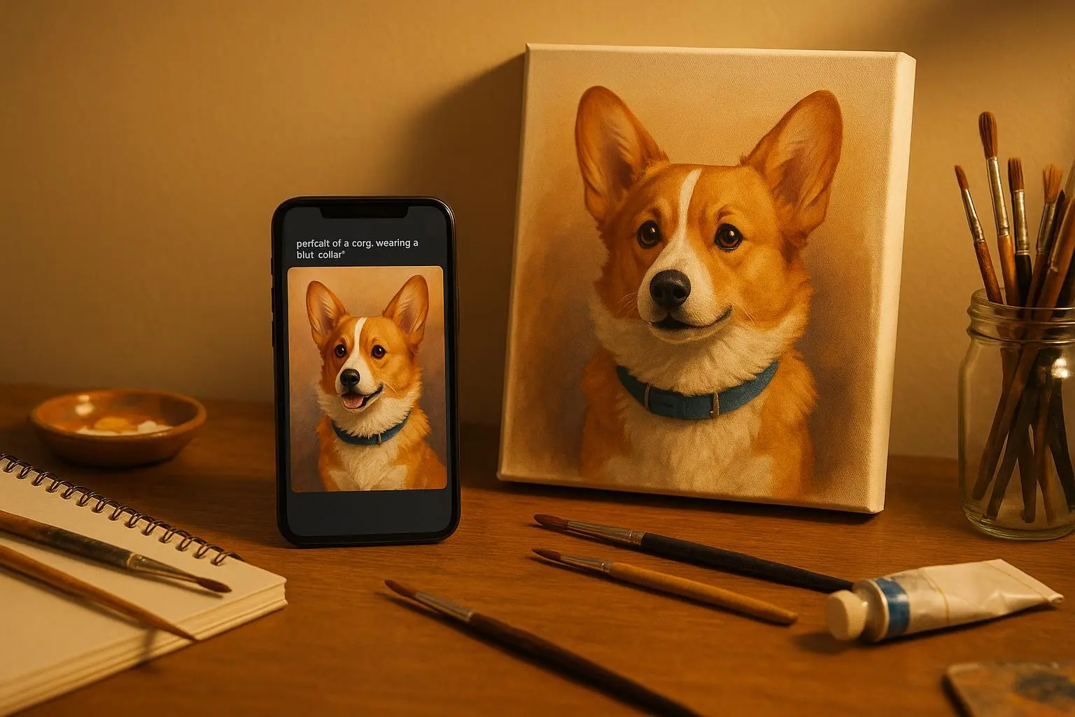
In practice, PPP helps you move from “I have a cute photo” to “Here’s a ready-to-print product you can list today.” The on-ramp is low: you describe what you want, pick a style, generate a few options, and pick the one that resonates. It’s not magic; it’s prompt engineering with a friendly UI layer.
What PPP actually does for you (the practical flow)
Here’s the straightforward workflow I use, which is the sweet spot for speed and quality:
- Start with a clear base: a photo of your pet if you have one. This anchors the facial features and helps the AI hit the mark on likeness.
- Write a precise prompt: your subject, action, mood, and style. Short, punchy prompts work better than long paragraphs. If you want a photorealistic portrait of a dog lounging by a fireplace, you’ll likely get closer results with a prompt that names lighting and setting.
- Pick a style: PPP offers presets like photorealism, oil painting, watercolor, or a stylized digital render. The style choice sets the overall mood and how bold the textures appear.
- Generate multiple options: you usually get several renders. Pick the best, refine the prompt if needed, and re-run.
- Export at high resolution: for prints, you’ll want 4K-ready exports or at least 300 PPI. If you plan to go large, upscale after export (more on that later).
- If you’re selling, validate licensing: make sure you’re comfortable with the commercial rights for the outputs in your PPP tier. I confirmed this personally before pushing any product live.
And here’s a micro-moment I learned from experience: the first time I used PPP, I assumed “photorealistic” meant “perfect on the first try.” It didn’t. I had to tweak lighting, pupil sharpness, and fur texture separately. The payoff came when I started treating prompts like a mini checklist—subject, pose, lighting, background, texture, scale—and not just “make Lola look cute.” The result was consistently better.
A real-story detour: what I learned the hard way (about 150 words)
I was building a small line of pet-themed phone cases and was eager to prove PPP could handle a diverse set of breeds. I started with a golden retriever named Daisy who loves the sunbeam by the living room window. The first render looked pretty, but the eyes felt off—too glassy, not lively enough. I tweaked the lighting to add a gentle rim and softened the highlights on the fur. Another round, and I got a result I could actually feel proud of: Daisy’s fur lifted with a soft glaze, the eyes had that warm sparkle that says “she’s alive in the photo.” I printed a sample on a mug and a phone case. People loved it, but the key moment was realizing the same prompt could yield wildly different results with small changes. That’s when I started thinking in micro-steps rather than one big prompt, which dramatically improved consistency.
A tiny detail that stuck with me: the difference a simple background choice makes. A dark, unobtrusive backdrop kept the fur texture front-and-center, while a busy background pulled attention away from Daisy’s face. It’s not about “the best-looking prompt” as much as “the right prompt for the product you’re selling.”
Mastering prompts: specific tips that actually help
If you want repeatable results, focus on precision. Here are practical prompts and tricks I use:
- Nail the subject and pose
- “A golden retriever lying on a sunlit living room rug, head slightly tilted, soft fur detail.”
- If you want action, be explicit: “bounding through a meadow with wildflowers, ears flapping, tongue out, dynamic motion blur.”
- Control lighting and mood
- “Warm rim lighting from the left, golden hour glow, soft shadows.”
- For a studio feel: “even, neutral lighting, no harsh shadows, high-detail fur texture.”
- Texture and medium cues
- Photorealistic: “high-detail fur, micro-hairs visible, wet nose, glassy eyes.”
- Painterly: “oil-painting texture, visible brushstrokes, canvas texture.”
- Comic/illustrative: “high-contrast lines, bold color blocks, flat shadows.”
- Background and composition
- Simple: “soft gradient background, no clutter.”
- Contextual: “porch with potted plants, late-afternoon light, shallow depth of field.”
- Fine-tuning without overfitting
- If features look off (eyes too large, muzzle too long), tweak one variable at a time: “eye size reduced by 5%,” “slightly longer muzzle,” “pupillary reflection softened.”
- Negative prompts (when available)
- Exclude unwanted elements: “-collar, -glare, -crowded background.” If the model keeps adding hats, you can explicitly tell it to stay hat-free.
One practical rule I’ve found useful: write prompts as if you’re giving a photographer a set of short instructions. The more actionable, the less misinterpretation PPP has to deal with.
The “commercial viability” lane without the mystique
If you’re thinking about selling PPP-generated art, you’re not alone. A surprising number of makers are doing well by combining PPP outputs with print-on-demand services. The business logic is simple: fast iteration, low upfront costs, scalable product lines.
Key questions to answer before you launch:
- Do you have commercial rights to sell PPP outputs at your chosen subscription tier? Most commercial-usage plans cover that, but read the terms for your exact tier.
- Can your print provider reproduce the chosen style cleanly at the sizes you want? Some textures scale better than others.
- Do you have a plan for copyright risk? Don’t copy an artist’s exact style or name-drop living artists in prompts; it can invite legal headaches. It’s safer to craft unique stylistic elements rather than mimicking someone else’s unique voice.
In practice, the best ROI comes from pairing PPP with a strong post-production pipeline. I use three tools in combination: PPP for the fast generation, Remini for input photo quality (more on that in a moment), and Canva for mockups and product sheets. Upscaling is your friend when you plan big prints; it preserves detail without exporting lower-res images first.
A quick note on quality control: when you’re selling, you’re not just selling art—you’re selling trust. Stamp your product pages with clear photos of the artwork at multiple sizes, show close-ups of fur texture, and be transparent about the generation process if your audience cares about it.
Input image quality: why Remini matters, and when to skip
I used Remini early on to clean up source photos. PPP loves a crisp base image; if you feed in a blurry face or noisy fur, PPP has to guess too much, which often leads to soft or odd results. Remini isn’t a miracle worker, but it buys you a cleaner starting point: better facial fidelity, fewer artifacts, and smoother color transitions.
Here’s a quick workflow I actually use:
- Start with a decent photo (ideally 4-6 inches of the pet’s face, good lighting).
- Run it through Remini to sharpen details and reduce noise.
- Import the enhanced photo into PPP as a reference (optional). Then craft your prompt around the enhanced image’s key features.
- Generate a handful of options with different styles. Pick the best, then do final touch-ups in Canva if needed.
If you’re on a tight budget, you can skip Remini and still get good results with a carefully chosen prompt and a clean photo. But the extra step often pays for itself in print-quality consistency.
The “how-to” for a beginner (step-by-step)
- Step 1: Gather a photo or a clear text idea
- If you don’t have a photo, start with a vivid textual description. The better you articulate pose, lighting, and mood, the more accurate the render.
- Step 2: Choose a style
- For gifts or home decor, photorealistic or oil-painting vibes work well. For social media, a stylized render with bold colors can stand out.
- Step 3: Write a tight prompt
- Include subject, pose, lighting, texture, and the intended output quality.
- Step 4: Generate and evaluate
- Pick 3-5 options. Compare facial fidelity, fur detail, and how well the style matches your intent.
- Step 5: Refine and upscale
- If you’re printing large canvases, upscale to preserve detail. Use a reputable upscaling tool to avoid artifacts.
- Step 6: Mock up your product
- Use Canva to place the portrait on mugs, shirts, or wall posters. Check color consistency across devices.
- Step 7: Verify licensing
- Ensure your PPP tier covers commercial usage. If you’re uncertain, contact support and document the license terms you’re operating under.
- Step 8: Launch with intention
- Start with a small batch to test pricing, packaging, and delivery timelines. Use customer feedback to refine prompts and styles.
A practical storytelling ending: the impact you can create
The first time I shipped a small batch of PPP-based prints, I watched a customer unwrap a framed portrait of their rescue dog. The smile that spread across their face wasn’t about technical perfection; it was about noticing the dog’s personality in a way they hadn’t expected to capture at home. The art felt personal, and the order didn’t disappear into a shelf—it sparked a string of follow-up purchases for friends and family who wanted a similar piece. That moment reminded me what people actually want: something that honors their pet with care and a little bit of magic.
There’s no secret here—consistency wins. When you deliver a good-looking portrait in a reliable, repeatable way, your customers aren’t just buying art. They’re buying trust that you’ll understand their pet the way they do.
Things to watch out for (the honest reality)
- Not every prompt will hit the mark. That’s normal. Build a small library of tested prompts for common poses and fur textures.
- Some breeds present a challenge for certain lighting setups. If the eyes look odd or the fur texture isn’t right, tweak lighting first, then color balance, then texture.
- If you want to scale, consider a workflow that keeps your costs predictable. Batch generate, pick the best pieces, and limit the number of edits per order to stay efficient.
- Be mindful of the ethical and legal landscape. Avoid mimicking living artists’ exact styles too closely, and don’t misrepresent outputs as hand-drawn by a specific artist.
How to keep learning without getting overwhelmed
- Start with one product line and one style. Once you’re confident, add a second style or another product category.
- Follow a few trusted prompts and refine them over time. The Pareto principle applies here: 20% of your prompts will drive 80% of your best results.
- Use community examples as a ladder, not a template. Learn from what others describe as “the trick” but apply it to your own pet and context.
The ethical corner
AI art raises questions about copyright and creative ownership. My stance is simple: know the licensing terms for your PPP tier, and don’t rely on AI to imitate living artists or brands. The best value comes from original prompts that translate your pet’s personality into a unique, ownable style. As the technology evolves, keep an eye on the legal landscape and adjust your workflow accordingly.
Final thoughts: your first high-quality PPP portrait is closer than you think
Pet Portrait Pro is a powerful tool, but it’s not a magic wand. It’s a partner in your creative process, helping you translate a memory into a tangible product you can share or sell. When you treat prompts like precise instructions, when you optimize lighting and texture, and when you pair PPP with a simple post-production workflow, you’ll produce portraits that feel earned—because they are.
If you’re just starting out, my best advice is to keep it simple, test quickly, and iterate with intention. The moment you see a canine grin or a cat’s knowing gaze emerge with clarity in the render, you’ll understand why people keep coming back for more.