Advanced PromptCrafting: Optimize PromptCanvas for Consistent Brand Imagery and Batch Outputs
May 21, 2026 • 9 min
You can get lucky with a single AI-generated image. You can also try to scale that luck into 500 consistent assets and discover it’s not luck at all—it’s engineering.
I’ve spent years turning single-shot AI art into predictable pipelines for product lines, marketing campaigns, and marketplaces. This post is the practical, no-ideology guide I wish I'd had when I started: clear techniques for prompt tuning, controlling lighting and composition, managing seeds for batch work, and finishing images so they survive marketplace QA.
Think of this as the four-pillar playbook: Brand Tuning, Composition & Lighting, Seed Management for batches, and Marketplace Compliance. Each section has tactics I use weekly, plus real-world gotchas that will save you time and angry emails.
The problem: consistency is non-negotiable
Clients don’t want “nice images.” They want a set of visuals that read like one brand—same mood, same character, predictable colors, and repeatable composition. The naive prompt “a hip young founder in cozy lighting” will give you variety. Too much variety.
Here’s what I learned the hard way: you can’t just bolt on the same adjective to every prompt and expect uniformity. You need structure—weights, negatives, seeds, and a rule for post-processing. Do that and AI becomes a production tool instead of an art toy.
Pillar 1 — Brand tuning: make the brand a parameter, not a suggestion
If you want the same character, palette, and texture across dozens of images, treat brand attributes as formal parameters.
Start with a compact brand spec in your prompt:
- character description (age, ethnicity, distinguishing features)
- palette (main color + accents, use Pantone names if available)
- material/texture (matte leather, satin fabric)
- mood and context (weekday morning, cinematic, editorial)
Then weight the important parts.
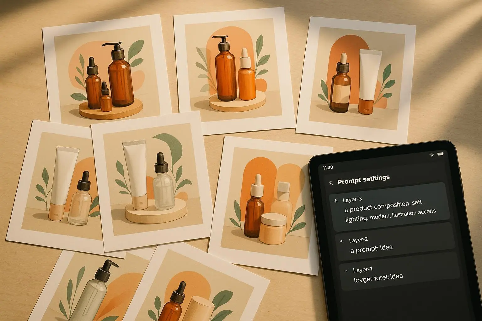
Most PromptCanvas-like systems support style weighting (e.g., [brand-character:1.6], [studio-palette:1.2]). Use it. Put the highest weights on the things that must not change: character face, primary color, and texture. Lower weights for flexible bits like props or secondary background elements.
But weights alone aren’t enough. Negative prompting is your safety net. Add targeted negatives for the things that trip up brand consistency: "no asymmetry," "no mutated limbs," "no extra fingers," "no neon gradients"—whatever your model tends to hallucinate.
Practical prompt snippet: "a friendly mid-30s South Asian female founder, consistent face features, shoulder-length hair, warm cinnamon skin, [brand-character:1.6], matte leather chair [material:1.2], palette: Pantone 7527 (warm beige) with Pantone 186C accents, minimal background — no asymmetry, no mutations, no extra limbs, no text overlays"
That last bit—explicitly forbidding artifacts—reduces noisy surprises. It won’t be perfect, but it makes failures consistent and fixable.
Pillar 2 — Composition and lighting: stop saying “dramatic” and start describing setups
“Good lighting” is the worst instruction you can give a model if you need repeatability.
I used to type things like “soft dramatic lighting” and then spent hours culling. The breakthrough came when I forced myself to write lighting like a photographer writes it: three-point studio lighting, 50mm lens, f/2.8, softbox left, rim light right, shallow depth of field. That level of specificity changed the output overnight.
Composition control is just as crucial. If your brand needs product shots with negative space on the right for text overlays, say so in camera terms: "rule of thirds, product on left third, negative space right, low-angle front view, 85mm, f/4."
Useful camera and lighting descriptors to keep in your prompt toolbox:
- Composition: rule of thirds, low-angle, overhead flat lay, close-up macro, negative space
- Lenses/optic feel: 50mm f/1.8 for natural portrait, 85mm for studio headshots, 24mm for wide environmental
- Lighting: three-point studio lighting, softbox key, rim light, high-key (bright whites), low-key (deep shadows), volumetric fog
A short aside I still remember: the first time I swapped “dramatic lighting” for “three-point studio lighting, 85mm lens, f/2.8” the model stopped inventing random shadows that chopped faces. It’s small but it changes whether you’re spending hours in post or shipping assets.
Micro-moment
If a single word sticks with you: "be specific." It’s cheap to type and priceless for reproducibility.
Pillar 3 — Seed management and batch workflows: make repeatability the point
When you scale from 1 to 100 images, two things become critical: reproducibility and controlled variation.
Locking the seed gives you reproducibility. Use a chosen seed for a family of images so the core structure—facial geometry, product proportions, horizon lines—stays intact. Then vary one parameter at a time: chaos +0.05, stylize -0.1, add a prop, shift lighting slightly.
My batch workflow (practical, battle-tested):
- Run 20 exploratory images, varying the prompt and weights.
- Pick 3 successful seeds that match the brand spec.
- For each seed, run batches of 50 where you adjust only one small parameter (e.g., chaos, lens focal length, or a single adjective).
- Tag output with metadata: seed, prompt version, model version, date, and any parameter deltas.
This metadata saves careers. Trust me.
But here’s the ugly truth: seeds are brittle. Models update. A seed that worked yesterday can produce nonsense after a model tweak. So always document the exact model version and hash. If you’re building a commercial pipeline, archive the model snapshot or maintain a locked environment for production runs.
Also: seeds aren’t a creative cure-all. They preserve structure but don’t guarantee the exact same face across 1,000 variations. For hyper-specific face consistency you’ll eventually need custom fine-tuning or a control module (ControlNet-style face conditioning).
Real story: the product launch that nearly failed
I was hired to generate 600 lifestyle images for a DTC brand’s seasonal launch—product + model in vignettes. We picked a seed that gave the perfect face and product proportions. Confident, we ran three batches of 200 and handed them over.
Two days later the client asked for a different shirt color. Simple—except the model rolled an update that night. The same seed now produced a different face and a warped product reflection. I spent 48 hours re-running the whole batch, reverting to the old model snapshot, and redoing color grading. We missed the delivery window, lost trust, and I learned to always snapshot the model and archive seeds before a release. The client kept the images, but we priced the next job differently. Documentation is part of your contract.
Pillar 4 — Marketplace compliance: post-process like your revenue depends on it
I won’t sugarcoat it. Generative outputs get flagged by stock platforms and printers for tiny reasons: artifacts, non-standard color profiles, or low-frequency noise that hides at 1080p but explodes at 4k.
Treat post-processing as part of your pipeline, not an afterthought.
The essential steps:
- Upscale with a high-fidelity tool (Topaz Gigapixel, Remini, or comparable). Native upscalers in model UIs are convenient but often leave subtle noise.
- Artifact removal: run an AI denoiser or manual healing pass in Photoshop. Check edges, eyes, teeth, and fabric seams.
- Color calibration: match to Pantone swatches or client LUTs. Do this in linear color workflows and export both sRGB and CMYK when the client needs print.
- Metadata and provenance: embed EXIF with seed, prompt, model version, and author using ExifTool. Many marketplaces now require or prefer provenance info.
- Final QA: zoom to 100%, check skin textures, remove text remnants, confirm shadows look natural when composited on white/transparent backgrounds.
Marketplace rejections are predictable. The common culprits are:
- Low resolution for the requested print size
- Hallucinated text or fingerprints in unexpected places
- Asymmetrical anatomy or extra digits
- Color shifts that miss the brand palette by more than a perceptual delta
If you plan to sell on stock platforms, make a checklist and automate as much of it as possible.
Tools that actually help
I use and recommend:
- Topaz Gigapixel for upscaling (does a cleaner job than many native upscalers)
- ExifTool for embedding seed/prompt/model metadata
- Lightroom or Photoshop with LUTs for color matching
- A small local server or container that can snapshot the exact model version you use for a campaign
Automate tagging outputs with seed, prompt version, and model hash. If a marketplace asks “which model did you use?” you’ll want that exported like a receipt.
Tactics that are surprisingly effective (and often overlooked)
- Negative seeding: use negative prompts to nudge away recurring errors (e.g., "no HDR artifacts", "no text, no watermark"). Combined with style weights, this stabilizes output fast.
- Prompt templates: maintain a library of prompt templates for each asset type (hero product, lifestyle headshot, flat lay). Templates reduce cognitive load and variance between operators.
- Incremental changes only: when batching, change one variable per run. If you change three, you’ll never know which change broke the aesthetic.
- Version prompts like code: prompt_v1_2025-07-11 — it sounds excessive until you need to reproduce something in a year.
When to stop pushing prompts and start fine-tuning
There’s a point where prompt engineering stops being effective: when you need hyper-consistent faces, or a proprietary character in 10,000 contexts. That’s when you either:
- Fine-tune a model on curated brand assets, or
- Train a small control model (ControlNet for poses/faces) plus a recovery pipeline
Fine-tuning costs time and compute, but for long-running brands it pays for itself in reduced QA and quicker production cycles.
Final checklist before you ship a batch
- Prompt weights and negatives locked and saved
- Seed(s) chosen and archived with model hash
- Batch metadata exported to CSV (seed, prompt, model, render settings)
- Upscaled and denoised assets checked at 100%
- Color matched to brand spec (LUT or Pantone check)
- EXIF metadata injected with provenance
- Deliverable formats exported (sRGB, CMYK, PNG/JPEG/TIFF as required)
- QA pass and acceptance doc for client sign-off
If you do all that, the odds of a marketplace rejection or a “this face changed” panic drop dramatically.
Closing: make promptcrafting a repeatable discipline, not a hobby
Generative models are powerful because they let us iterate fast. But speed without discipline is chaos. Treat promptcrafting like a craft with repeatable steps: define the brand spec, translate it into weighted prompts + negatives, lock seeds for structure, batch with one-variable changes, and finish with professional post-processing and provenance.
I won’t promise perfection—models update, edge cases happen, and you’ll still get weird outputs sometimes. But do the work I described, and you’ll be turning unpredictable experiments into a reliable production pipeline that your clients can sign off on.
If you want, start today: pick one existing prompt that produced a “close” result. Add three specific camera/lighting lines. Add one weighted brand token. Lock a seed. Run a batch of 25. Tag everything. You’ll either ship faster or learn exactly what to tweak next—and that feedback loop is where real progress lives.