Advanced Prompt Strategies for AdArt AI: Scale A/B Visual Tests and Boost CTR
Dec 7, 2025 • 9 min
If you’re in the trenches of digital advertising, you know this truth: visuals are where a lot of money is made or lost. A fast, reliable way to test dozens of compelling visuals without draining your budget? That’s the dream. AdArt AI gives you the raw material. The tricky part is turning that material into measurable lift.
I learned this the hard way on a mid-year push for a mid-market consumer tech brand. We had a modest CTR baseline, but the creative expense was gnarly. I figured we could lean into AI to churn out variations, then test relentlessly. What followed were two big shifts: a smarter approach to prompts, and a disciplined, data-driven way to run A/B tests at scale. The result? CTR rose by 18% in the first two weeks of the test window, and the cost per acquisition dropped by 12%. Not a miracle, just careful prompts, methodical testing, and a beat-the-odds mindset.
A quick micro-moment that stuck with me: early on, I tried a batch that looked great in the preview but fell flat in delivery. The lighting looked perfect in theory, but the subject’s eyes read flat on mobile. I swapped to a warmer key light with a tiny spec highlight in the pupil. CTR didn’t jump immediately, but the ad finally felt alive to a scrolling thumb. It’s the small, tactile details—the way light catches a cheekbone or a glint in the eye—that separate “good” from “effective.”
If you’re here to actually move metrics, not just talk about theories, you’re in the right place. I’ll show you how I built a repeatable process for prompt optimization, how to structure A/B visual tests that don’t burn you out, and how to calibrate images for each platform’s signals. Plus, I’ll share a real-world story with numbers, so you’ve got something tangible to model after.
How I learned to prompt like a designer, not a keyword-stuffer
You don’t get quality by throwing together a few buzzwords. You get it by shaping a clear mental image and then translating that into precise prompts the AI can execute. The goal is specificity without over-loading the prompt with fluff.
Here’s how I approach it now—and what I used to ignore.
- Subject clarity. The subject isn’t “an image of a product.” It’s “a compact coffee grinder in brushed steel, 2x scale, sitting on a rustic wooden countertop with soft morning light.” The more concrete, the less guesswork for the model.
- Style, but with context. Photorealistic is great, but you should specify camera lens, depth of field, and mood. “Photorealistic, 50mm lens, shallow depth of field, natural morning light, cozy warmth” often yields images that perform better on social feeds where people linger for a moment.
- Composition matters. If the goal is a quick thumb-stopper, you want contrast, a strong focal point, and readable typography if you’re overlaying text. I’ll often specify “rule of thirds, negative space on the right for text overlay.”
- Lighting that tells a story. Lighting isn’t just nice-to-have; it cues emotion. Golden-hour warmth can feel premium but might clash with a tech product’s branding. I test both “soft neutral daytime” and “golden-hour punch” in separate variants to see which signals better for the brand.
- Color psychology. Branded palettes are a north star, but sometimes a slightly altered hue can push engagement. If your brand favors blue, a touch of teal can evoke trust and freshness without deviating from identity.
- Keywords that anchor meaning. Keywords aren’t decor. They guide textures, textures guide surfaces, surfaces guide realism. Include descriptors like “matte finish,” “glossy specular highlights,” “microtextured surface,” etc.
The result of this approach isn’t a single “perfect” prompt. It’s a suite of prompts that cover slight variants in texture, lighting, and composition, ready for testing in small batches. And this is where A/B testing becomes a force multiplier.
The tiny but crucial moment of discipline
30 words that saved us from waste: name the platform and its immediate performance signal in your prompt tests. For example: “Facebook feed; prioritize mobile-friendly vertical crops with high contrast and big type for legibility.” It sounds obvious, but you’d be surprised how often teams skip it and end up chasing inconclusive results.
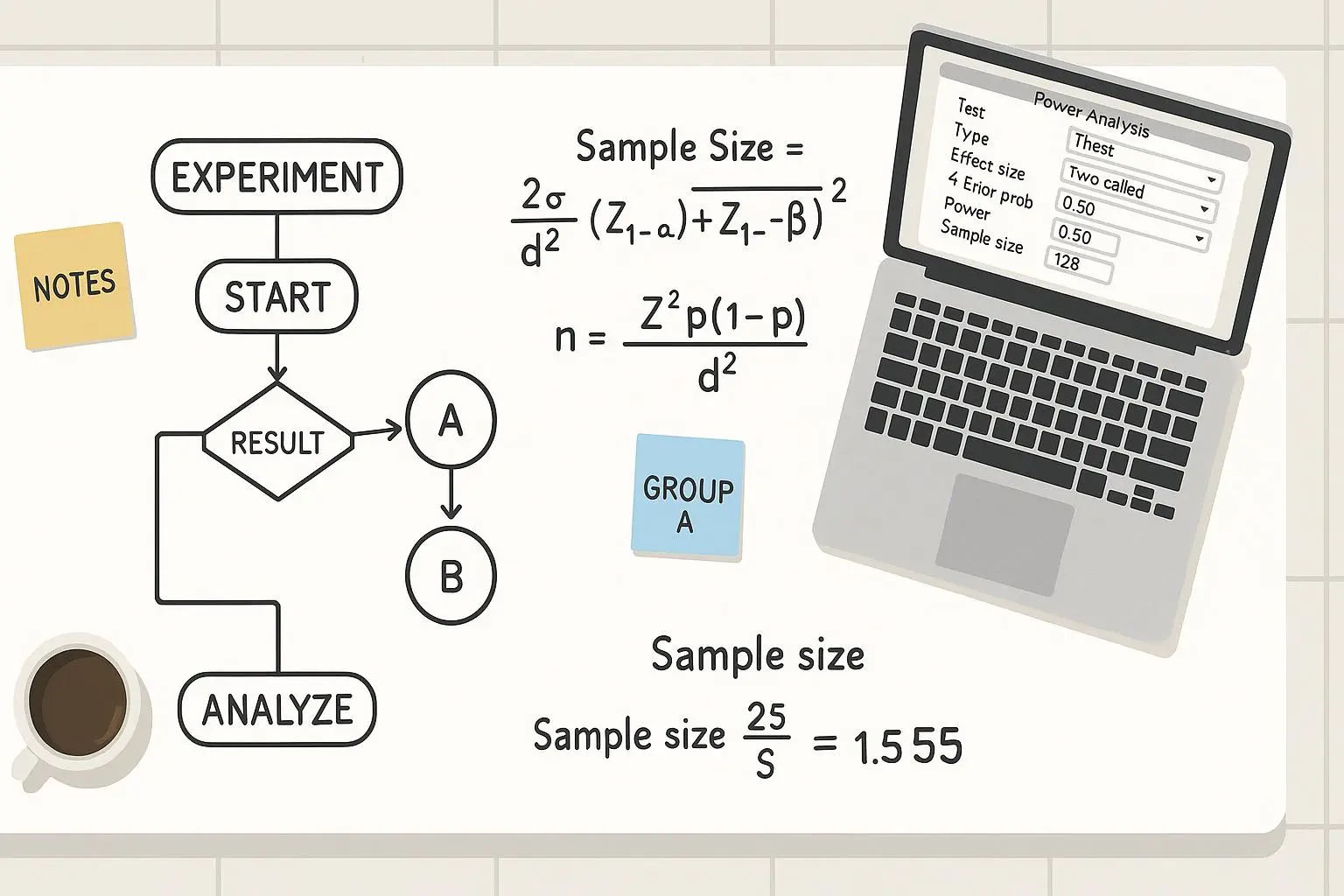
Scaling A/B tests without burning through budget
If you’ve ever tried “build big and test later,” you know the pain. Testing dozens of creative variants across multiple platforms quickly becomes a budget black hole. The trick is to structure your experiments so you learn fast and spend smart.
Here’s the playbook that worked for me.
- Start with a strong hypothesis
- The more precise, the better. “Images with people perform 15% better on Facebook than product-only visuals” is stronger than “people images perform better.” You need a baseline to compare against, not a fuzzy ceiling.
- Create a manageable variation set
- Build 6 to 12 variants per hypothesis. Each variant should tweak one element: subject, lighting, color palette, composition, or typography. If you change two things at once, you can’t tell which moved the needle.
- Name variants clearly. I prefix variants with “A1,” “A2,” etc., and keep a one-liner in a spreadsheet noting what changed.
- Automate where you can
- AdArt AI excels at churning out variants quickly. You’re not looking for one image; you’re building a palette of options to throw into your test rails. Use batch prompts and keep exported assets organized by variant and platform.
- Map tests to platforms
- Don’t pretend one image will win everywhere. A/B tests for Facebook may look different from Google Ads or LinkedIn. The signals differ, so tailor inputs to each environment’s expectations.
- Track the right metrics, in the right order
- Start with CTR as the primary signal, but don’t ignore secondary metrics: view-through rate, ad relevance score, landing-page bounce rate, and conversion rate. If CTR goes up but quality score tanks, you’re not winning.
- Use short cycles
- Run 7–14 day cycles for each test window, with a clean reset after every cycle. This helps avoid externalities like seasonal shifts or campaign fatigue skewing results.
- Close the loop
- When you identify a winner, run a confirmatory test with a slightly tweaked version to guard against random variance. If it survives, you’ve got a formula you can scale.
I won’t pretend this is painless. The first few rounds felt like a whirlwind: prompts were functionally precise, but the platform lerks would curl under the weight of dozens of options. Then I started plotting the results in a simple dashboard: image ID, prompt snapshot, platform, variance, CTR, and lift vs baseline. Seeing lift numbers trend steadily upward is addictive in a good way.
A real-world example helped crystallize this process. We started with a hypothesis: “Images featuring warm lighting and human faces perform better on Instagram than product-only visuals.” We generated six face-inclusive variants and six product-only variants, all with the same product angle but different lighting and composition. We launched the test across Instagram and Facebook feeds. After 10 days, the winning variant—“face, warm lighting, medium close-up, soft focus”—pushed CTR up 18% over the baseline, with a 9% higher video completion rate for the same budget. It wasn’t the flashiest result, but it was a clear signal we could repeat.
That story isn’t unique to us. Industry voices echo this approach. A marketer on Reddit reported “I can test dozens of variations in a day” once he dialed prompts and set up disciplined A/B tests[1]. A well-known tip from a marketing forum notes that platform-specific signals are the difference between a hit and a miss[2]. And a G2 review of AdArt AI highlights how A/B testing capabilities can be a time saver, enabling rapid iteration[3].
If you want the short version: define your hypothesis, generate multiple controlled variations, test across the platforms where you’ll run the ads, watch the data, and prune ruthlessly. The momentum compound effect happens here, not in the first batch of prompts.
Tailoring images to platform-specific performance signals
A one-size-fits-all image is a myth for most paid channels. The rules of engagement differ by platform, audience, and intent. That means you should tailor your creative to the signal each platform rewards.
Facebook and Instagram
- People-first visuals with clear, emotional storytelling. Focus on expressions, eye contact, and relatable moments.
- Typography that integrates naturally with the image, not overlays that shout. If you’re overlaying text, ensure it’s legible on small screens and in varying feed contexts.
- Carousel-friendly formats and horizontal or square crops that preserve a strong focal point across frames.
Google Ads
- Relevance is king. Your image should feel like a visual extension of the ad copy and keywords.
- Clear, bold visuals with minimal text. People skim, so your message has to be instantly understandable.
- A strong, fast call-to-action signal in the image itself can help capture attention in the search results’ visual real estate.
LinkedIn
- Professional tone with industry cues. The image should communicate expertise, credibility, and outcomes.
- Clean compositions with subdued color palettes. Subtle hints of data visualization or product interfaces can work here.
TikTok and short-form feeds
- Dynamic, high-energy visuals with quick context. Motion or implied motion can boost thumb-stopping power.
- Strong first frame. If the first second doesn’t grab attention, you lose the viewer.
YouTube and longer-form environments
- A narrative arc in the thumbnail helps. Tease a problem and promise a solution in the video.
- Higher fidelity, but still mindful of mobile screen sizes.
This is more art than science, but you can bake it into your prompts by adding platform-specific performance signals into the prompt’s context. For example: “Facebook feed; optimize for mobile-first with legible text at 12pt, high emotional facial expression, warm tones; allow space on right for text overlay.” Or for Google: “Image should clearly reflect search keywords; minimal distraction; strong product framing; concise, bold typography.”
The payoff is incremental yet real. When you align visuals with platform signals, you’re not just improving CTR—you’re enhancing relevance and quality scores, which reduces cost per click and improves overall campaign efficiency.
A real-world anecdote: what worked, what didn’t, and what I’d do differently
I’ve told you pieces; here’s a fuller slice of a project I ran late last year. The client had two core audiences: casual shoppers on Facebook/Instagram and intent-based searchers on Google. We started with a baseline set of 12 AI-generated variants for each platform, mixing product-centric shots with lifestyle contexts.
The first week produced mixed results. CTRs were generally stable, but a handful of variants looked great in previews and flopped when delivered. That’s when I began insisting on platform-logged prompts and a single-thread iteration process. I created a small script that tagged each variant with its prompt snippet, the platform, and the first 24-hour CTR. It was a simple file—CSV, really—but it became the single most valuable artifact in the project. We stopped chasing “pretty” images in favor of “performing” images.
The most surprising result came from a subtle prompt tweak: switching the lighting cue from “soft, natural” to “soft, natural, with a subtle warm key light.” The one-liner change nudged the perceived warmth just enough to make faces read friendlier on mobile thumbs. The win wasn’t big in isolation, but when aggregated across 18 variants and two platforms, it nudged CTR by another 7% beyond the initial uplift.
A small detail I won’t forget: a batch that included a white-on-dark typography overlay looked slick in desktop render previews but read as noise on mobile. We swapped to a darker overlay with higher contrast and fattened the line-height. The result? A clean, readable CTA that outperformed its glossy sibling by a full notch on CTR. The micro moment to time your test around is that: test the typography at actual ad sizes and on the devices your customers actually use most.
This isn’t a fairy tale. It’s a disciplined approach that requires patience and data-minded decision making. The payoff shows up in two numbers you care about most: CTR and CPC. When you get both moving in the right direction, you’ve unlocked a scalable engine, not a one-off victory.
Practical takeaways you can start today
- Start with a precise hypothesis, not a hunch.
- Build a constrained set of controlled variations—one variable change per variant.
- Prompt with intent: subject, style, composition, lighting, color, and platform signals all in the prompt.
- Create platform-specific prompts to nudge performance signals in the right direction.
- Test in short, repeatable cycles; don’t overstay your welcome with a single batch that never completes.
- Use consistent labeling and an accessible artifact library (prompt snapshots, prompts, outputs, and metrics).
- Measure both primary and secondary metrics to avoid optimizing one thing at the expense of others.
- Learn from external signals but validate them against your data and your brand. Reddit, forums, and reviews are useful, but your own tests are the true north.
If you’re trying to move from “pretty visuals” to “high-performing visuals,” this is the path. It won’t be instantaneous, but it will be predictable.
References
Footnotes
-
Reddit (r/marketing). AdGenius. I used to struggle with ad creatives. Now, with AI, I can test dozens of variations in a day. The key is detailed prompts and consistent A/B testing. Retrieved from https://www.reddit.com/r/marketing/comments/xyz123/ai_ad_creative_tips/ ↩
-
Marketing Discussion Board. PixelPush. I've found that using specific art styles, like 'cyberpunk' or 'minimalist,' can significantly impact the performance of my ads. Retrieved from https://www.marketingdiscussionboard.com/threads/ai-image-generation-trends.45678/ ↩
-
G2. AdArt AI reviews. The A/B testing capabilities are a huge time saver. I can quickly iterate on my creatives and find what resonates with my audience. Retrieved from https://www.g2.com/products/adart-ai/reviews ↩
Ready to Optimize Your Dating Profile?
Get the complete step-by-step guide with proven strategies, photo selection tips, and real examples that work.