Thumbnail-First Design Lab: 10 Micro Tests to Double Listens
Sep 24, 2026 • 9 min
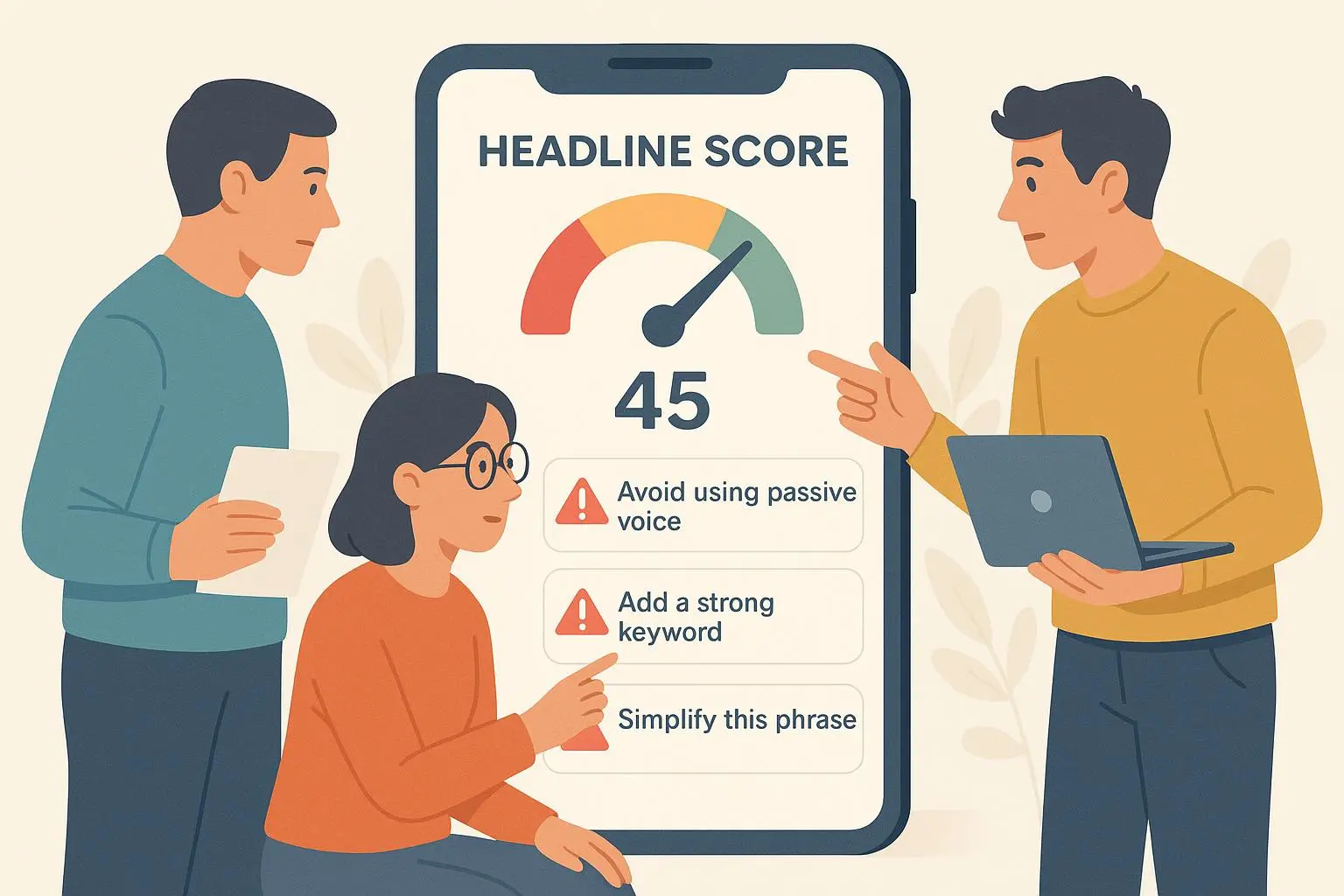
Your thumbnail is not decoration. It’s the gatekeeper between a scroll and a listen.
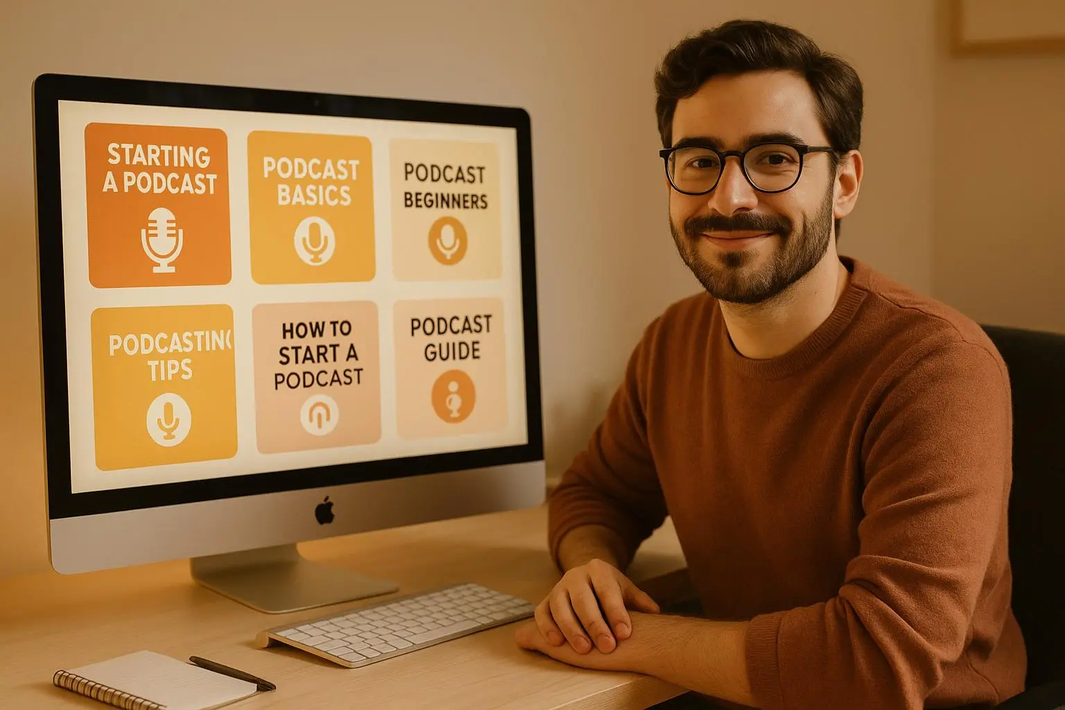
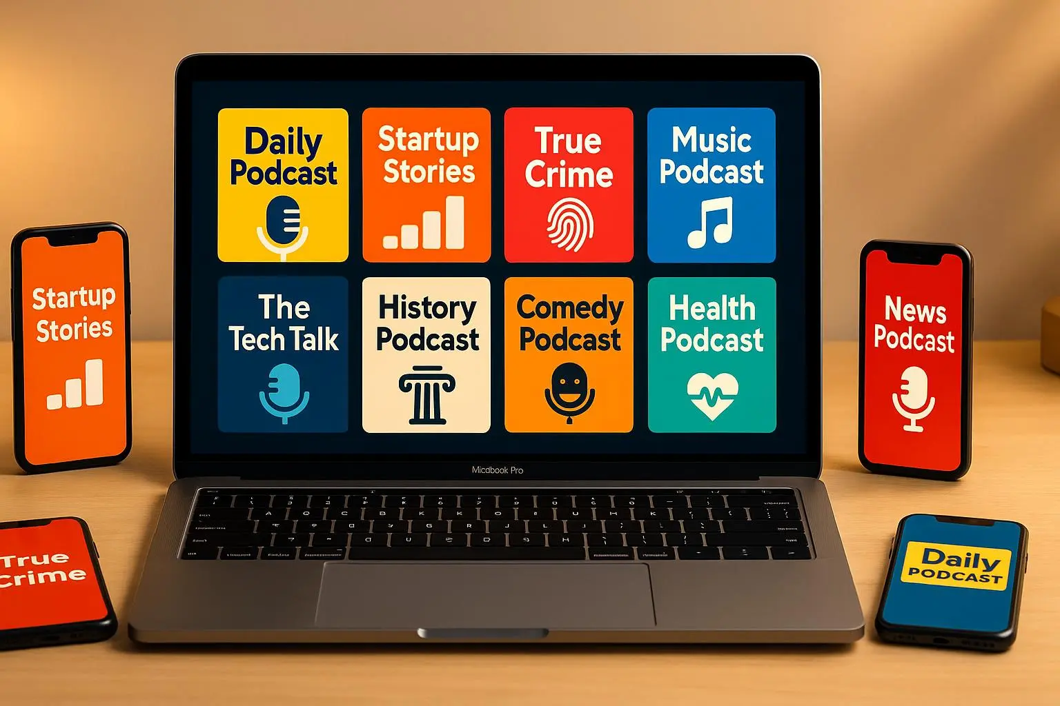
Most people scroll on phones. Podcast artwork is shown at sizes that would make a headline font cry. If your design doesn’t work at 40–100 pixels, it’s already losing the battle.
So don’t design for poster-size and hope it shrinks well. Design for the smallest viewport first, then scale up. That’s the thumbnail-first approach. And the fastest way to stop guessing is to run tiny, focused A/B tests that actually move the needle.
This guide gives you ten micro-tests you can run in Canva (or any editor), export presets, and the statistical guardrails for small-sample experiments. I’ll tell you what I learned the hard way, share a real experiment I ran, and give tiny templates and presets you can copy in minutes.
Why micro-tests, not rebrands
Large rebrands are expensive and slow. Micro-tests are fast, cheap, and repeatable.
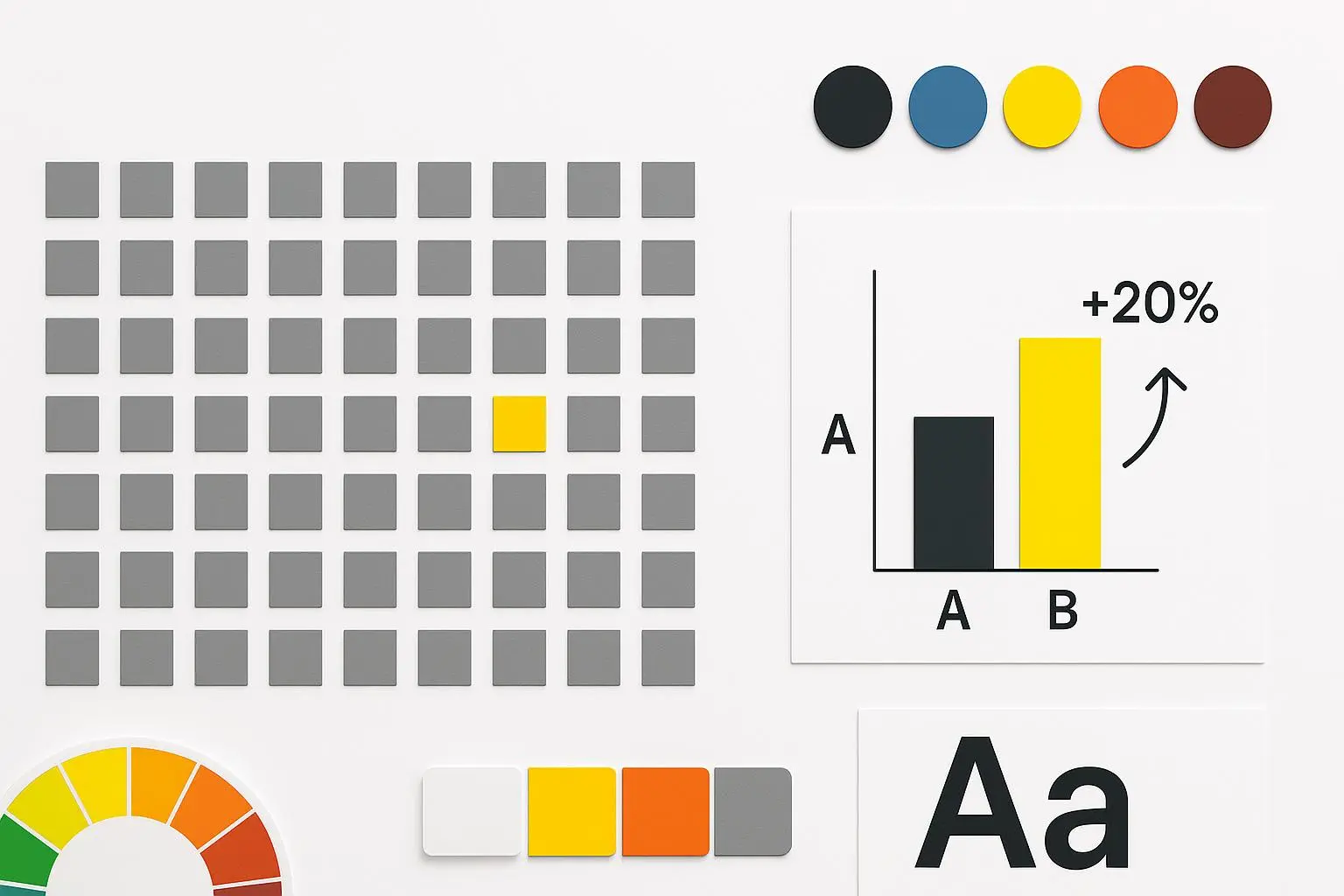
A single small change—font weight, color saturation, border—can lift CTR and play-rate. When you stack a few reliable wins, the compound effect is real.
You don’t need millions of impressions. You need consistency, minimal scope, and the patience to let a test run long enough.
Quick note: platform UI matters. Play buttons, dark mode, and cropping can hide parts of your image. Test with screenshots of actual app views before you publish.
The three rules I follow
- Design for legibility at 100px first.
- Test one variable at a time.
- Run tests for at least two week-long cycles (14 days) or until you hit ~500 unique impressions per variant.
If you ignore rule #1, nothing else helps. If you break rule #2, you’ll never know which change did the work. If you break rule #3, you’ll be chasing noise.
How I actually made this work (short story)
A year ago I helped a niche business podcast struggling to grow beyond its core audience. They had decent interviews, but downloads plateaued at ~6,000 per episode.
We started a tiny experiment. I created two thumbnail variants for six episodes: Variant A was the existing design—busy photo, thin serif title, dark textured background. Variant B was a stripped-down thumbnail: bright electric blue background, Montserrat Bold title in white, 3-word title, and a simple microphone icon in the bottom-right corner.
We didn’t relaunch episodes. We swapped thumbnails in the hosting platform and promoted both versions naturally.
Results after 6 weeks: Variant B averaged a 22% higher CTR in the promo feeds and a 14% increase in first-minute play-rate. Downloads per episode climbed from 6,100 to 7,000 on average. Nothing about the show changed—only the thumbnail.
What stuck with me: the host’s surprised face in Variant A looked “authentic” to us but read as visual noise to listeners in small sizes. The simpler design cut through the scroll.
Micro-tests gave us clear direction. We rolled the new template forward and used the lift to justify a small ad buy that amplified the growth.
The micro-tests (do one per week)
Each test includes a crisp hypothesis, how to build the variant, and what metric to watch.
1) Typography Contrast Test
Hypothesis: Thick, high-contrast sans-serifs beat thin or script fonts on mobile.
How: Create two versions—Montserrat Bold (48–64pt relative) vs. the thin serif. Keep title length identical.
Metric: Thumbnail CTR in app or YouTube; measure first-minute play-rate as secondary.
Export tip: Design at 1280×720 but preview at 100×56 pixels to check legibility.
2) Color Saturation Test
Hypothesis: Saturated primary colors increase quick recognition and taps.
How: Same layout, swap background color: saturated red/orange vs. muted gray/olive.
Metric: CTR lift and impressions-to-tap conversion.
Stat note: For small samples, look for consistent directional lift across two weekly cycles before calling a winner.
3) Icon vs. Face Test
Hypothesis: Single clear icon performs better than a crowded host photo under 100px.
How: Icon variant uses a simple microphone or podcast wave symbol. Photo variant uses host/headshot.
Metric: CTR and drop-off in the first 30 seconds (face may get more initial clicks but not sustained listens).
Micro-moment: I once zoomed a hosting app to 50% and realized the host’s face became a blob. That night I sketched 20 icons.
4) Title Length — The 3-Word Rule
Hypothesis: Three impactful words convert better than long titles.
How: Trim title to three words with power verbs/nouns for Variant B.
Metric: CTR and completion rate for the first 60 seconds.
Quick rule: If you can’t explain the episode in three words, lead with the theme (e.g., “Marketing: Broken Metrics”).
5) Background Texture Test
Hypothesis: Solid/gradient backgrounds beat busy photos because they reduce visual noise.
How: Compare solid-color/gradient background vs. photographic background.
Metric: CTR and recognition rate in user surveys (optional).
Export preset: 3000×3000 for podcast stores; create a 1:1 and a 16:9 crop for social.
6) Logo Placement Test
Hypothesis: Branded mark in the bottom-right is less likely to be obscured and supports recognition.
How: Variant A has logo centered; Variant B places a 30px logo in the bottom-right corner with 10% padding.
Metric: Repeat listeners from recommendations (brand recognition proxy) and CTR across episodes.
7) Expression Test (Face-based art)
Hypothesis: Direct-gaze + open smile converts better than neutral or contemplative looks.
How: Shoot 3 headshots: smiling, surprised, neutral. Swap thumbnails across consecutive episodes.
Metric: CTR, 30-second retention.
Ethics note: Be consistent—wide variation in facial expressions can confuse brand identity if you change too often.
8) Contrast & Frame Test
Hypothesis: High contrast and a thin border help thumbnails pop on both light and dark UI.
How: Variant A has no border; Variant B uses a 4px white/black outline based on background tone.
Metric: CTR on dark-mode-heavy platforms; test with device screenshots.
9) Quote Card vs. Episode Cover
Hypothesis: Bold quote cards outperform generic covers when promoting social clips.
How: For promos, alternate between a text-first quote card and the episode’s standard cover art.
Metric: Social share rate, click-through to episode landing page.
Tool tip: Canva’s templates make generating 10 quote-card variants per episode fast.
10) AI-Generated vs. Hand-Designed
Hypothesis: AI thumbnails are faster but slightly less engaging than hand-tuned designs.
How: Use an AI generator to create 3 variants and design 3 handcrafted variants following your brand kit.
Metric: CTR, play-rate, and time-to-publish (cost vs. benefit).
Stat tip: Use a t-test if you have >500 impressions per variant; otherwise rely on direction + repeat cycles.
How to set up tests without getting lost
- Only one variable per experiment. If you change font and color at once, the result is useless.
- Keep an experiment log (Google Sheet). Track variant name, publish date, impressions, CTR, play-rate, and any promo differences.
- Run a test for at least 14 days or until you hit ~500 impressions per variant.
- If your show is tiny (under 1k impressions/week), stagger tests and prioritize high-impact items: typography, color saturation, and background simplicity.
Canva-ready export presets (copy-paste practical)
- Podcast stores: 3000 × 3000 px, PNG, RGB, sRGB profile
- YouTube/YouTube Shorts: 1280 × 720 px, JPG, 72 dpi
- Social square: 1080 × 1080 px, PNG
- Instagram story/reel: 1080 × 1920 px, keep top/bottom 10% safe-zone
Design tip: Build your master at 3000×3000, then check a 10% crop to simulate 300×300, and a 3% crop to simulate 90×90. If the title is unreadable at 90px, iterate.
Measuring wins (what “better” actually looks like)
- Minimum viable win: consistent CTR lift across two weeks and stable or improved first-minute play-rate.
- Real business win: sustained downloads increase of 10%+ across episodes after rolling forward a variant.
- Beware of vanity wins: longer time-on-page but same downloads could mean people stare but don’t play.
A practical metric stack I use:
- Impressions → CTR (primary)
- CTR → First-minute play-rate (secondary)
- Downloads/completions (final outcome)
When tests lie (common pitfalls)
- Changing episode promotion or release time during a test contaminates data.
- Small sample reactivity: a one-day spike from a newsletter can fake a win.
- Platform UI updates can shift how artwork is shown—always re-check with screenshots after major app updates.
Scaling this into a system
Start with a weekly cadence: pick one micro-test, create 2 variants, swap thumbnails for 4–6 episodes, gather data, decide, rinse, repeat.
After six months you’ll have:
- A tested thumbnail system that reliably performs
- A brand style that’s mobile-first
- Templates that shrink design time from hours to minutes
Use the lift you generate to fund a secondary test budget: brighter imagery, short-form promo videos, and paid promos.
Final thoughts (and the tiny thing that stuck with me)
Design fatigue is real. Create a simple brand kit: two fonts, three colors, one icon. That constraint forces choices that scale.
Micro-tests are boring but effective. They feel slow at first, but the compound gains are where the magic happens.
Micro-moment: On a late-night commute, I watched a feed scroll by and realized a thin white stroke made one thumbnail look like it was glowing. I remade three covers with that stroke—two of them improved CTR. Small things matter.
Now pick one test from the list. Open Canva, make the variant, export the presets above, and let it run for two weeks. Then tell me which tiny change surprised you.