Quick Start: Create Stunning AI Pet Portraits from Text Prompts
Sep 1, 2027 • 9 min
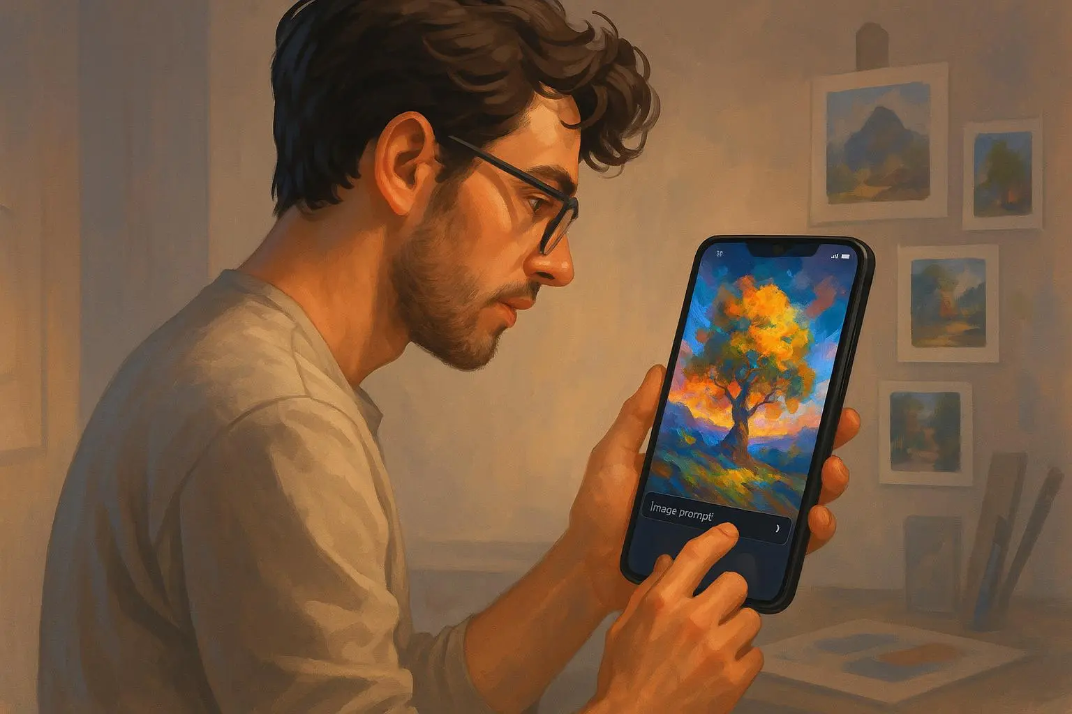
If you’ve ever looked at a dog portrait and thought, I could do better, you’re in the right place. This isn’t a brag about big-genius prompts. It’s a practical, hands-on guide for beginners who want to turn plain text into art that actually sells or hangs on a wall.
I’m going to walk you through what I’ve learned after dozens of tries, with real numbers you can actually use. No fluff. Just the parts that help you get from “I have a pet” to “I have a print-worthy portrait.”
And yes, I’ll share a story from my own work—one that changed how I think about prompts, settings, and print quality.
The quick truth about AI pet portraits
AI art isn’t magic. It’s a tool. And like any tool, it’s only as good as the prompts you feed it and the outputs you’re willing to refine.
What I’ve found is simple: specificity wins. The more you spell out the pet’s traits, the mood you want, and the final use (print, storefront, gift), the closer you land to the result you expect.
If you’re aiming for a storefront or a gallery-worthy print, you’ll also care about resolution, upscaling, and file formats. Those aren’t afterthoughts; they’re part of the craft.
I’ll show you how I approach all of it, with concrete prompts and tested workflows you can copy.
How I actually made this work
This section reads like a mini walk-through of a recent project I did for a client who wanted a bold, museum-style portrait of a rescue pup named River. River’s owner wanted something that felt timeless—think oil painting, dramatic lighting, and a touch of modern color saturation.
First, I defined the constraints: a square print (18x18 inches) for a living room wall, 300 DPI at final size, with a black backdrop and River’s distinctive brindle markings. I wanted a painting-like texture rather than a hyper-real photo. I also planned three variants to pick from, to avoid the “one-and-done” trap.
I started with three prompts, all very similar but tuned for mood and texture. Here’s what one of them looked like after I iterated a couple of rounds:
- Subject: “River, an adult rescue Brindle Shepherd mix, medium build, brindle coat with white chest”
- Pose: “sitting, head tilted slightly to the left, gaze directly at the viewer, calm and noble”
- Setting: “dark studio backdrop with a subtle vignette, no props”
- Style: “oil painting, textured brushstrokes, warm golden-hour lighting, subtle film grain”
- Quality: “ultra-detailed, 8k, 3:2 aspect, painterly textures”
- Mood: “regal, timeless, a hint of whimsy”
Two things happened that I didn’t fully anticipate. One, River’s brindle pattern proved tricky. The AI could handle the general look but missed the specific striping on the shoulder. It wasn’t a deal-breaker, but it pushed me to add a negative prompt to discourage oversimplification of markings and to request “high-frequency texture” so the fur doesn’t look flat. Two, the golden-hour light made the eyes pop in a way I found surprisingly effective for a print.
The three variants were close, but one stood out. I upscaled to 6000x6000 pixels using a dedicated upscaler and saved as PNG (lossless, good for printing). The client loved the result and ordered a large canvas for their living room. We printed at 300 DPI and saw vibrant color and crisp brush details on a satin canvas. They sent a photo of it hanging—stars in River’s eyes and the brush texture that makes it feel real rather than digital.
Here’s the micro-moment that stuck with me as I was prepping the files: I noticed the studio light had a tiny color shift toward amber in the highlights. It wasn’t dramatic, but it gave the fur glow and made River’s eyes look more lifelike. Small details like that can push a good image into something that feels premium.
If you’re wondering about a more practical, repeatable workflow, here’s the template I use across almost all pets:
- Start with a basic prompt that clearly identifies the pet’s species, breed, and distinguishing marks.
- Add a pose and a simple background to guide composition.
- Layer in art style, lighting, and camera-like details (e.g., “close-up portrait,” “soft-focus background,” “bokeh”).
- Use quality modifiers (e.g., “ultra-detailed,” “8k,” “cinematic lighting”) to nudge the output toward a print-ready level.
- Generate multiple variants, then pick the best two or three for upscaling and minor edits in a photo editor.
- Save in PNG for printing, or TIFF if your printer or store requires it.
- Check licensing terms for commercial use before selling.
That’s the backbone. Now let’s get you from concept to print in a way that actually works for you.
Prompt basics: your starter kit
Think of prompts as a conversation with the AI. The more you reveal, the fewer surprises you’ll get.
- The pet as the star
- “A fluffy Persian cat” is fine, but “A fluffy white Persian cat with sapphire blue eyes and a tiny scar on the left ear” gives the AI something unique to latch onto.
- Breed and markings matter as much as color. If your dog has a distinctive white blaze on the chest, call it out.
- Pose and expression
- Simple prompts like “sitting” or “standing” are okay, but you’ll get more personality if you add mood: “proudly sitting with head lifted” or “playful, eyes bright, mouth slightly open.”
- Setting and background
- Backgrounds: “sunlit garden,” “cozy armchair,” “starry night,” “minimal black backdrop” all steer mood.
- For prints, a clean backdrop often reads better, but you can push a painterly background if you want drama.
- Style and finish
- Styles matter more than you think. If you want a painting, say so: “oil painting,” “impasto texture,” “canvas texture.” If you want a modern look, try “digital watercolor” or “photorealistic rendered style.”
- Lighting is the secret sauce: “golden hour,” “soft studio lighting,” “rim light,” “dramatic chiaroscuro.”
- Quality and resolution
- Add terms like “ultra-detailed,” “8k resolution,” and “high-frequency detail.” These cues push the model toward outputs that print cleanly.
A typical starter prompt you can copy-paste:
- “River, a brindle-coated Shepherd mix, adult, white chest, sitting with head slightly tilted, dark studio backdrop, oil painting style, warm golden-hour lighting, soft brush strokes, ultra-detailed, 8k resolution, 6000x6000, by a renowned painter.”
If you want to experiment, try this: generate three variants with the same prompt but swap the style: “oil painting,” “digital watercolor,” and “photorealistic.” Compare. You’ll almost always find one that’s closer to your vision.
Iteration: don’t chase perfection on the first try
The first render rarely nails it. That’s not a failure; that’s the process. The trick is to analyze what’s off and tweak.
- If fur texture looks flat: add “high-frequency fur detail,” “simulated brush texture,” or “impasto brushwork.”
- If the eyes look dull: specify “crisp, reflective catchlights,” and “eye detail emphasized.”
- If markings aren’t accurate: try “preserve unique markings,” “no color bleeding,” or even negative prompts like “no blur on fur texture.”
- If the background competes with the subject: tighten the crop or push the background toward a velvet, out-of-focus look with “soft focus” and “bokeh background.”
I’ll admit: I’ve spent an afternoon chasing a single marking on a terrier. It started as a misread of the brindle stripes in the shoulder, then a tweak to the color balance, and finally a prompt that called out the exact stripe pattern in the pose. The third variant finally captured the dog’s identity, not just its general look. It’s not glamorous work, but it’s the kind of hands-on refinement that matters when you plan to print or sell.
Quick tip: keep three variants at a time. It’s enough to compare styles and composition without spiraling into decision fatigue.
Optimizing for prints and storefronts
This is where a lot of people trip up. It’s not “just make it pretty.” It’s “make it print-ready and legally safe to sell.” Here’s how I approach it.
- Resolution and aspect ratio
- For a canvas or poster, you want high resolution. I target at least 300 DPI at the final print size. If your client wants square, use 1:1. For wall art, 3:2 is a classic print aspect. If you’re unsure, start with a square 6000x6000 or a 6750x4500 canvas and scale down if needed.
- Most AI tools let you set an aspect ratio. If yours doesn’t, compose with a square output and crop later in a photo editor.
- Upscaling
- If you generate at 1500x1500 but want a 24x24 inch print, upscale. AI upscalers do a decent job if you’ve kept the detail in the prompt. I’ve seen print quality jump when upscalers preserve edge detail and texture rather than smoothing everything out.
- File formats
- PNG for most print tasks because it preserves sharp edges and transparency when needed.
- TIFF if you’re running a pro lab workflow or want the best possible print fidelity.
- JPG is fine for quick proofs or storefront previews, but lose some detail due to compression.
- Licensing and rights
- The legal piece is messy and evolving. Some platforms give you full commercial rights; others restrict use or require attribution. Always double-check the terms before you start selling. If you’re selling, consider a model where you provide a signed print with a note on AI-assisted creation to avoid misrepresentation.
- The market’s watching. Artists and buyers care about originality and fair use. If you’re selling, be transparent about AI involvement and how you added value (the prompt craft, the curation, the physical print quality).
- Color management and proofs
- Subtle color shifts happen between screen and print. Do a soft-proof in your editor with a calibrated monitor. If your print lab offers a color profile, use that. If you’re sending to a market or store, ask for a proof and adjust accordingly.
- Metadata and branding
- Add a small signature or watermark for digital proofs, but keep it out of the main print if you want a clean look. Consider a catalog of “collection” names and story blurbs that give buyers context about the portrait.
- Ethical considerations and originality
- Some buyers expect something unique. If you have a signature approach (particular brush texture, a recurring color treatment, or a custom background approach), lean into it. It helps with repeat business and reduces the risk of “AI-generated sameness.”
The storefront angle: selling AI pet portraits
If you’re turning this into a business, you’re playing in two worlds: art and commerce. You’re going to need a workflow that scales.
- Start with a clear pricing ladder: basic print, premium canvas, and a digital print license for online storefronts. For example, a 18x18 inch canvas might be priced around $180–$300, with digital license adds $40–$80.
- Build a prompt template library. A few well-done prompts can be used as baselines for different pets. You’ll refine each one for a given pet, but you’ll save time on the first pass.
- Offer add-ons: custom backgrounds, pets in different costumes or settings, seasonal stylings. These upsells are where you can increase average order value without a huge uptick in production time.
- Invest in a lightweight post-processing routine. A 15–30 minute pass to adjust color balance, sharpen textures, and ensure print readiness goes a long way to making customers happy. It’s better to spend time here than to rely on a single AI output.
A friend of mine runs a small storefront offering AI-assisted pet portraits. She keeps a tight tiered pricing plan, a short turnaround, and a couple of “editor’s picks” for customers who can’t decide. Her conversion rate improved when she started showing side-by-side proofs: one image straight from the engine, one lightly edited print-ready version. People love seeing the transformation and knowing what they’ll actually receive.
A practical note: where you publish matters. If you’re selling on Etsy or a similar marketplace, include clear prompts about the process and provide a print-ready file. If you’re selling on your own site, you can offer a “design-your-own portrait” flow with multiple prompt presets and examples. The key is transparency and a solid promise on print quality.
Common mistakes (and how to dodge them)
Overlooking the print path in the prompt
- The best-looking digital image can fall apart in print if you don’t plan for resolution and texture. Always think end-to-end: prompt, render, upscale, print.
Believing “photoreal” is always best for prints
- For portraits, painterly textures often look richer on canvas. Don’t default to photoreal if your aim is artful, wall-ready work.
Underestimating backstory or personality
- Buyers want a story as much as the image. A short caption about the pet’s quirks or a note on the portrait’s inspiration can elevate a purchase.
Ignoring licensing
- If you plan to sell, you must know what rights you have for commercial use. Better to know up front than face a dispute later.
Poor color planning
- If your print shop has a color profile, mirror it in your workflow. A tiny color mismatch can ruin a gorgeous portrait on a wall.
A concrete, repeatable process you can steal
- Gather pet specifics
- Breed, markings, eye color, notable scars or features, personality cues (regal, goofy, curious).
- Craft a starter prompt
- Include subject, pose, setting, style, lighting, and quality modifiers.
- Generate three variants
- Pick two to three that feel closest to your vision.
- Upscale and refine
- Upscale to print-resolution and adjust textures or colors in a photo editor.
- Print-ready package
- Deliver PNG or TIFF at 300 DPI, with a color profile if needed, plus a short backstory caption.
- Offer the product
- Print, canvas, digital license. Add a note about the AI-assisted process to build trust with buyers.
- Gather feedback
- Ask customers for their impressions and what they’d change. Use their feedback to fine-tune your prompts and style templates.
This approach keeps you moving without getting stuck chasing the “perfect” prompt. It also creates a repeatable system you can scale up.
Real-world example: River and the art that followed
To ground this in something you can actually replicate, I’ll tell you about River again. The initial render was good, but the markings looked generic. I adjusted the prompt to emphasize “distinct brindle pattern with high-contrast stripes” and added “painted brush texture” to push away from a flat look. I also specified “dark studio backdrop with a subtle vignette” to keep the focus on River.
The second version still wasn’t perfect—the eyes needed more life, the fur needed more texture. I added “crisp catchlights” and “high-frequency fur detail” to the third variant. That combination finally clicked. The portrait looked like River, not a proxy for a dog I’d seen in a screenshot. I upscaled to 6000x6000, saved as PNG, and printed on canvas. The client bought it for a living room and later became a repeat customer for a second portrait of their other pet.
That story isn’t fancy. It’s a reminder that small tweaks—both in subject description and technical prompts—make big differences when you’re aiming for wall-ready art.
Here’s a tiny aside that stuck with me: the moment the printer woke up and started its first pass on the canvas, I could smell the faint scent of warm ink and tip-over anxiety—would the color match the screen? That sensory reminder kept me honest about color calibration and proofs. It’s the kind of micro-detail that keeps your craft human, not robotic.
References
Ready to Optimize Your Dating Profile?
Get the complete step-by-step guide with proven strategies, photo selection tips, and real examples that work.