ImagixAI Troubleshooting: Fixing Image Quality Issues in AI Art
Oct 28, 2026 • 9 min
If you’re like me, you’ve spent hours chasing that moment when a prompt finally feels “right.” The scene is clear in your head, the composition sings, and then—pixelation, odd artifacts, or a cascade of inconsistent styles across a batch pull you out of the moment. This post is about real-world troubleshooting for ImagixAI (and similar diffusion-based tools). It’s not a laundry list of hacks. It’s the learning I’ve carried from one messy project to the next, with concrete steps you can apply right away.
I’ll share a story from my own workflow, a few practical techniques, and the tiny details that stuck with me—the kind of micro-moments that save you when a render looks great in thumbnail but falls apart in print.
And yes, I’ll keep it practical. No fluff. If you’ve got a deadline or a client looking over your shoulder, this is the guide I wish I had when I started.
My quick, honest take: where most people trip
Here's what I’ve learned the hard way: you can’t just press a button and hope for print-perfect results. AI art is a collaboration between your prompt, the model, and the post-processing you’re willing to do afterward. The base model can give you a beautiful starting point, but to get consistent quality across a series—whether you’re producing a comic panel, a product catalog, or a game asset—you need a repeatable workflow. That’s the heart of real improvement.
A quick aside I learned on a stubborn Sunday afternoon: I was chasing a painterly look for a fantasy panel and kept getting wildly different textures from one image to the next. I spent two days chasing “consistency” with prompts alone. Then I realized the unglamorous truth: the seed, the sampler, and the post-step choices mattered just as much as the prompt. The little things are what keep you from chasing your tail.
Micro-moment: in one session, a near-invisible color fringe along the shadow edge tipped me off that I was fighting a mismatch between the upscaler I’d chosen and the base render. It sounds tiny, but it made a big difference when I swapped tools and tuned the scale.
Now, let’s get practical. Below are the core problems you’ll bump into and how I fix them without sinking into analysis paralysis.
Understanding the root causes of AI art quality issues
Before you start chasing symptoms, it helps to know why these issues happen. AI models learn from huge, imperfect datasets. The end result often reflects those limitations: resolution trade-offs, artifacts from the sampling process, or a drift in style across frames or frames within a batch.
- Lower base resolution often comes from a speed-for-capability trade-off. The model is generating quickly, which means fewer details get baked in. If you’re planning to print or display large, that matters.
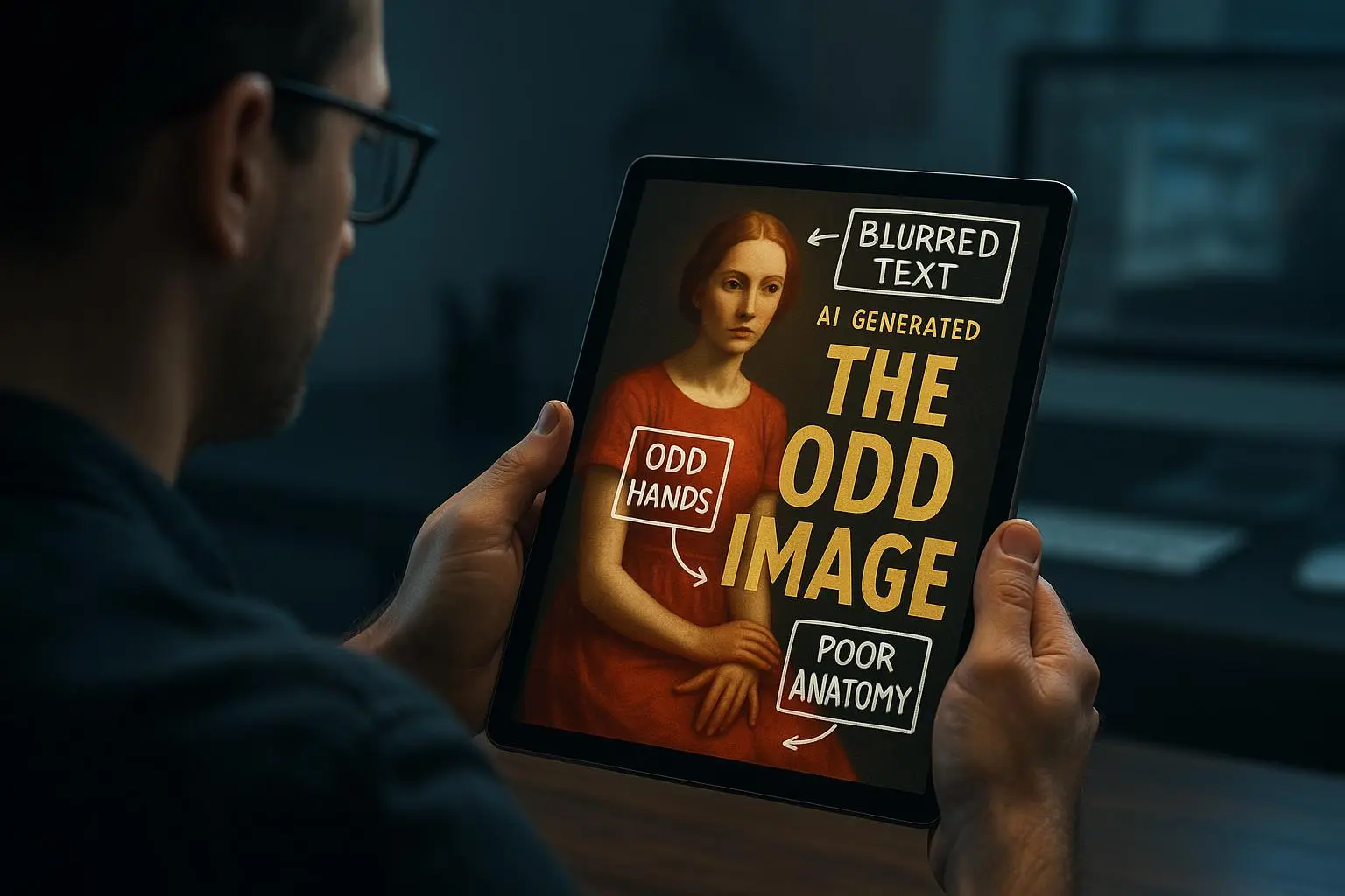
- Artifacts can be glitches from the sampling process or misinterpretations of complex prompts. Extra limbs, odd textures, or "noisy" areas are common culprits.
- Style drift across a batch happens when the same prompt is interpreted slightly differently from run to run. Tiny changes in seed, sampling method, or guidance scale can snowball into a distinctly different look.
These aren’t “problems” you can fix with one magic setting. They’re the result of a workflow, from model choice to prompt craft to post-processing.
1) Tackling resolution limits and pixelation
The most common gripe: the image looks great small, but when you zoom in or print large, it loses fidelity.
What works for me:
- Upscaling is your main weapon. Use a purpose-built AI upscaler to add detail rather than just resize. Tools like Topaz Gigapixel AI are reliable, but there are solid online options too. If your platform offers built-in upscaling, use it—ideally after you do the final refinements in the same toolchain.
- Generate at a higher “workflow-ready” resolution when possible, then upscale. Some platforms let you render at a modest resolution and then refine with a remix or variation step. The key is to keep details flowing into the upscaler, not stressing the base image at the edges.
- Prompt for detail. Explicit prompts like “ultra-detailed, 8K resolution, intricate textures, photorealistic lighting” push the model toward richer features. The base resolution doesn’t always change, but the perceived fidelity does when you guide the model toward detail.
I’ve run a small experiment with a character portrait: two variants at the same base resolution, one prompted for “intricate textures and crisp lines” and the other not. The detail-forward prompt yielded a noticeably crisper print even before upscaling. It’s not magic—it's signaling the model to allocate more capacity to fine features.
Real-world takeaway: never skip the upscaling step for print or large-format use. It’s the cleanest path to maintain fidelity without overhauling your entire prompt.
2) Eliminating unwanted artifacts and distortions
Artifacts—like extra limbs, distorted faces, or odd textures—are the boulders in your creative path.
What I do when artifacts crop up:
- Negative prompts. This is a powerful, often underrated tool. Tell the model what you don’t want: “(ugly, deformed, extra limbs, mutated hands, blurry, low quality, bad anatomy).” Weight the negative terms to suit how stubborn the issue is. It’s a bit of trial and error, but you’ll see results after a few iterations.
- Seed exploration. Each render uses a seed. If artifacts show up, vary the seed slightly and generate a few more frames. Sometimes a small seed change is enough to nuke the artifact without altering the core idea.
- Inpainting or outpainting. For stubborn areas, use an editing tool with AI-powered inpainting to fix localized regions. You can regenerate just the problematic section while keeping the rest intact. It’s not cheating if you’re aiming for a clean final piece.
- Model version awareness. If your platform offers multiple base models or tuned versions, try a different one for your subject matter. Some models handle the same prompt with fewer artifacts because of how they were trained.
A quick anecdote: a batch of fantasy creatures kept producing a ring of odd texture around the shoulders. Negative prompts helped—but the real breakthrough came from switching to a model tuned slightly differently for anatomy between versions. The difference was subtle in individual frames, but across a sequence the artifacts vanished.
Reference note: research into diffusion models and sampling explains why some artifacts appear and how model choices influence artifacting (Goodfellow et al.; Ho et al.)[1][2].
3) Achieving consistent style across batches
Consistency across a series is the heartbreak of many projects. You nail one image and the rest drift into a different vibe.
What helps me keep a line across a sequence:
- Fixed seed and controlled variations. If you have a “golden” frame with the exact look you want, use its seed for the rest of the series. Then tweak prompts to steer composition while preserving style cues.
- Detailed, explicit style prompts. Don’t just say “fantasy art.” Call out era, medium, and lighting in concrete terms: “fantasy art by Frank Frazetta, oil painting, dramatic lighting, high contrast, muted color palette.” The more you describe, the likelier the style sticks.
- Image-to-image reference prompts. If the platform supports image-to-image prompts, feed the best “golden” frame as a reference while guiding the system with text instructions. This helps the model anchor its output to your target style.
- Style adapters (LoRAs or checkpoints). For advanced users, training or using a LoRA or a specialized checkpoint can embed a consistent style across generations. It’s a deeper technical route, but the payoff can be huge for long-running projects [Citations: Hu et al.; Ramesh et al.].
If you’re already in a production workflow, consider adding a “style-check” pass: render a quick set, compare with the golden frame, and only proceed if you’re within a tight tolerance. It’s boring, but it saves you from rework down the line.
Advanced tips for quality control
The devil’s in the details here. I’ve learned to mix in some habit-forming checks that pay off.
- Sampler experiments. The sampler choice (Euler, DPM++ variants, etc.) changes detail and texture slightly. If you’re chasing crisp edges or smooth gradients, try a few samplers and compare side-by-side.
- Guidance scale (CFG scale). This is the lever that keeps the image faithful to the prompt. Higher CFG makes the output stick closer to the prompt, but can exaggerate artifacts. Lower CFG can produce more creative, less predictable results. Find your sweet spot by testing a small batch with a range of scales.
- Prompt weighting. Use parentheses or brackets to emphasize or de-emphasize components. For example, (detailed eyes:1.2) intensifies eyes; [soft shadows:0.8] cools down the background. It’s not a gimmick—weighting helps steer the model’s attention where you want it.
- Community wisdom. The AI art world is a living lab. Discords, subreddits, and prompt-sharing threads are full of practical prompts that mirror real-world results. Don’t reinvent the wheel completely; borrow, adapt, and cite where useful.
Micro-moment I picked up here: a batch where the background kept “swimming” in color—like a watercolor wash. A quick tweak to the background divisor and adding a subtle color-stability seed fixed it. Sometimes the fix is as small as adjusting the background weight or a minor prompt tweak.
My actual workflow, end-to-end
I’ll walk you through a practical, real-world workflow I used on a recent project—a short, cinematic fantasy sequence with a strong character focus.
- Step 1: Baseline render. I generated a batch of frames at 768x768. The look was gorgeous, but the skin textures looked muddy, and the backgrounds flickered in a few frames.
- Step 2: Diagnostic pass. I checked the seeds, samplers, and CFG scales across the batch. The seeds varied enough that a few frames had subtle anomalies; the sampler choice wasn’t ideal for skin texture; and the default CFG scale was a touch conservative for the character’s facial features.
- Step 3: Resolve resolution and texture. I upscaled each frame after a quick pass to tighten detail, then ran a second, refined render at a higher conceptual fidelity. I nudged the prompt toward more skin detail, lighting cues, and micro-surface textures (pores, subtle freckles) without making it overbearing.
- Step 4: Artifact cleanup. I used negative prompts to push away distortion tendencies and added a focused inpainting pass for the few frames with odd artifacts around the jawline and hairline.
- Step 5: Style consolidation. I identified a “golden” frame from the set that matched my target style and used its seed for a remix pass on the rest of the frames. I refined prompts to keep the same light direction, color palette, and brush-like texture cues across the batch.
- Step 6: Final pass and print considerations. I applied a final upscaling pass and did a light color-grade to ensure consistency across devices and print tests. I also did a small print test on a 12x18 poster to verify fidelity before handing it to the client.
The result: a cohesive sequence with high-resolution frames, clean edges, and a consistent painterly feel across the entire set. The client could read the narrative through the visuals without getting distracted by technical quirks.
If you want to replicate at home, start with a simple 3-5 frame test. The goal isn’t perfection on the first try; it’s learning how your prompts, seeds, and post-processing interact to deliver repeatable results.
Quick workflow cheat sheet (the way I actually use it)
- Always plan for upscaling. Don’t wait until after you’ve decided the image is “final”; treat upscaling as part of the pipeline.
- Use a golden frame as your reference for style. Seed-forward thinking helps you stay consistent.
- Use negative prompts early and often. It’s the fastest way to cut common artifacts.
- If things drift, look at seeds, samplers, and CFG scale next. Often a one-parameter adjustment is enough.
- Don’t skip post-processing. A little color grading, edge refinement, and targeted inpainting can save you hours and a lot of heartache.
Why all this matters in practice
If you’re building assets for a game, a comic, or marketing visuals, the cost of inconsistency is real. A single misaligned frame can derail a sequence, kill the mood, and force rework in multiple departments. The parts of the process that feel mundane—seed management, negative prompts, and repeatable prompts—are the levers that keep your output professional rather than patchy.
And yes, I know the impulse to chase “the perfect prompt” exists. But the truth is, the best-looking AI art often emerges when you combine thoughtful prompting with disciplined workflows, solid upscaling, and light-but-meaningful post-processing. The model is a tool; your pipeline is the craft.
Common pitfalls I see and how to dodge them
- You chase a single image’s look, not a batch’s. If your goal is a series, map out the key style cues first (lighting, color palette, texture language) and then run a short batch to verify consistency before you commit to a full run.
- You skip validation against print or display targets. A close digital look can hide printing quirks. If you intend to print, do a test print early and adjust accordingly.
- You rely on a single tool for every step. A two-step approach—generate in AI, then detail and fix in a post-processing tool—tends to deliver better results than trying to do everything in one pass.
If you’re curious about the lore of why these techniques work, there’s interesting research behind diffusion models and how they learn from data. The core ideas echo what you already know from traditional design: clarity, restraint, and deliberate detail matter more than a laundry list of features.
And for those who love a bit of nerdy context, a few foundational threads anchor these practices:
- Generative Adversarial Networks introduced the power of adversarial training for sharper, more realistic images[1].
- Diffusion models refined image generation through noise-based denoising processes, enabling finer control over the creative details[2].
- Low-Rank Adaptations (LoRAs) and checkpoints let you embed stable stylistic elements into models, giving you the consistency you need across multiple renderings[3].
These aren’t just theoretical notes. They translate into your day-to-day work when you choose the right model, tune the prompts with intention, and curate post-processing with a trained eye.
The practical takeaway
- If you’re not getting clean results, reframe the problem as a pipeline issue—not a magical prompt problem.
- Start with a baseline that you know works and build a small batch around it. Use seeds, samplers, and CFG scale like knobs you turn until the batch looks coherent.
- Treat upscaling as a core step, not a luxury. It’s the fastest way I’ve found to preserve detail and prepare images for print or big displays.
- Use negative prompts and inpainting strategically to surgically remove artifacts without destroying the whole image.
- Maintain a single source of truth for style across a series. A golden frame with a fixed seed is your best friend for long-running projects.
If you want to go deeper, I’ve included a handful of references below that ground these practices in the broader research landscape. They’re not required to apply the tips, but they’re a useful map if you want to explore the why behind the how.
References
Footnotes
-
Goodfellow, I., Pouget-Abadie, J., Mirza, M., Xu, B., Warde-Farley, D., Ozair, S., Courville, A., Bengio, Y. (2014). Generative Adversarial Networks. arXiv. Retrieved from https://arxiv.org/abs/1406.2661 ↩ ↩2
-
Ho, J., Kumar, A., Norouzi, M. (2020). Denoising Diffusion Probabilistic Models. arXiv. Retrieved from https://arxiv.org/abs/2006.11239 ↩ ↩2
-
Hu, E. J., Shen, Y., Wallis, P., et al. (2021). LoRA: Low-Rank Adaptation of Large Language Models. arXiv. Retrieved from https://arxiv.org/abs/2106.09685 ↩