Fixing Poor Decal Renders Quickly
Jul 22, 2026 • 11 min
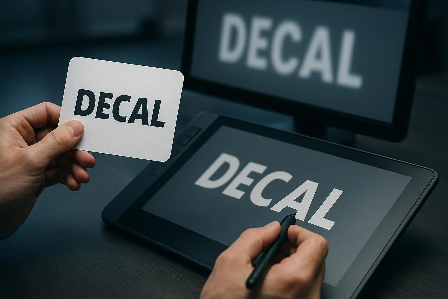
If you’ve ever watched a decal render crumble from on-screen glory to printed disappointment, you’re not alone. Blurry edges, misaligned placements, colors that look off in print—these are the kinds of tiny failures that waste hours and budgets. I’ve been there. I’ve stood in front of a screen, staring at a mirrored reflection of a bad decal, and watched the print shop hands shake their heads at a color that won’t cooperate. The moment I learned to troubleshoot decays like these, my workflow changed. This is the guide I wish I’d had back then.
In this post, you’ll get a practical, no-fluff checklist to diagnose and fix the three big culprits: blur, misalignment, and color mismatch. You’ll see concrete steps, exact export settings, and the mindset that makes this stuff click. And yes, I’ll share a real story from my own desk—the moment I stopped blaming software and started mastering the details.
Before we dive in, a quick micro-moment that stuck with me: I once spent a full afternoon tweaking a decal on a curved bottle, convinced the render was wrong. It wasn’t. It was my UVs, stretched by a fraction on the edge of the bottle. A 0.2% tweak in the unwrap and a re-render saved the entire run. Sometimes it’s the smallest adjustment that yields the biggest payoff.
If you skim, here’s what you’re after: keep your source crisp, map your texture with care, and export with a mind toward print precision. The rest will follow.
Understanding the problem in plain language
Why do decals go blurry, misalign, or drift away from your color intent?
- Blurriness often hides in low-resolution sources or export pipelines that compress too much. It’s the classic “text that should be crisp but looks fuzzy at 100%” trap.
- Misalignment happens when your 2D decal is mapped onto a 3D surface with imperfect UVs or when placement isn’t checked against the real geometry you’ll print on.
- Color mismatch is a quiet gremlin. The source image, the 3D software, and the printer all speak their own language. If you don’t align color spaces and profiles, you end up with a decal that looks right on screen but screams in print.
Now, I’m not here to throw buzzwords at you. I’m here to share the sequence I use to catch these issues before they become problems on a production run.
How I actually made this work
The best way to learn is through action. Here’s the workflow I rely on when I’m building decal mockups for a new product line.
- Nail the source image resolution
- Problem: A small logo blown up for a large print always looks soft.
- Rule of thumb: design at 300 DPI at final print size, or recreate the decal as a vector so it scales cleanly.
- What I do: I start with vector outlines whenever possible. If it’s a photo or a raster that needs to stay, I source the highest resolution version I can find and re-export at the exact final size for print. If you don’t have a higher-res version, vectorize it. The results are immediately obvious in the render.
- Verify UV mapping early
- Problem: The decal sits correctly in a flat image but warps or distorts once it’s on a curved surface.
- Approach: In your 3D tool, unwrap the surface with care. Start with a clean, overlapping-free UV layout. Use seam placement that mirrors how light and curvature will affect the decal on the real object.
- Practical tip: If you’re using automatic unwrapping, go manual for the edges that matter most. A tiny adjustment can stop a big distortion later.
- Fine-tune placement and scale
- Problem: The decal touches edges awkwardly or doesn’t align with product features (like logos beside a seam).
- Approach: Place with precise measurements. Use reference lines on your 3D model to check alignment against actual features on the product. Ensure the decal’s aspect ratio matches the surface area to avoid stretch.
- Quick check: zoom in on your edges at the render angle you’ll print from. If you wouldn’t want to stand at that distance, fix it.
- Align material and lighting
- Problem: Even with the decal correct, you get odd reflections or gloss that change color perception.
- Approach: Match the material properties to what the real product will use. Check reflectivity, roughness, and specular highlights. Lighting should be consistent with your print environment. This isn’t about “looking good on screen”—it’s about predictable color and finish when printed.
- Color management is not optional
- Problem: The decal’s hue shifts in print.
- Approach: Use consistent color profiles across the pipeline. Pick sRGB for on-screen previews and CMYK or a print-ready ICC profile for the final export if you’re sending it to a printer. If you’re purely digital, keep it consistent with your client’s expectations.
- Micro-note: A quick story—during a project, I forgot to convert to CMYK for a batch of mockups. The client asked why their purple decal printed brown. That one mistake cost us a whole reprint cycle. The lesson stuck: color profiles aren’t cosmetic, they’re a requirement.
- Export settings that actually respect detail
- Problem: Blurry, pixelated outputs from the export pipeline.
- Approach: Use lossless formats (TIFF or PNG) when prints matter. Lock in 300 DPI at final print dimensions, disable compression, and verify the color profile in the export dialog.
- Details to remember: If your viewer or printer strips EXIF or color data, you may need to embed the color profile in the file so the printer reads it correctly.
- Do a test print when possible
- Problem: Screen looks perfect, print reveals subtle misalignment or color drift.
- Approach: Small-format test prints catch issues you miss on screen. If you can’t print, do a high-resolution print-to-screen preview in your software and compare against a color checker.
- Outcome I’ve seen: A test print saved a client thousands of dollars in misprints by revealing a tiny misalignment before the full run.
Quick fixes you can apply in 60 minutes
If you’re under a tight deadline, here’s a practical sprint you can run:
- Replace any low-res decal source with a vector or high-res raster. If you can’t, redraw it at scale in a vector tool.
- Re-wrap the UVs if you see any noticeable distortion near edges or curved sections.
- Recheck the decal scale against the product geometry. A 2–3% difference can matter on curved surfaces.
- Tweak material settings so the decal sits in the same “space” as the product’s material. No more blown highlights.
- Normalize color profiles: sRGB for digital previews, CMYK or printer ICC profile for print proofs.
- Re-export at 300 DPI, lossless, with no texture compression. If you’re exporting textures alone, ensure they’re baked at the final render size.
And if you have a colleague who hates “engine talk,” keep this short for them: you’re fixing the decal so the print matches the idea. That’s the goal.
Real-world story from my desk (100-200 words)
A year ago I worked on a line of metal water bottles with a curved surface that eats decals for breakfast. The design team loved the artwork, but the first renders looked fantastic on the screen and came back as a muddy, misaligned mess in print. I blamed the software, the lighting, everything. I took a step back and traced the issue to UVs and color profiles.
I rebuilt the UV map by splitting the wrap around the bottle’s shoulder and adding a small seam at the back where there’s a natural crease. I re-stitched the decal for the curved surface with careful edge bleeding so it wouldn’t gape at the edges. Then I standardized color profiles—sRGB in the 3D app and a CMYK print proof for the final output. The first test print was nearly there, but the color drift was still off by about 2 Delta E units. I adjusted the lighting to mimic a print shop’s daylight, re-exported at 300 DPI, and did one more test. It was print-ready. When the client saw the mockup, they asked to double the batch. The lesson: the difference isn’t only the dots on the page—it’s the entire path from screen to print, with a few disciplined checks along the way.
Small detail that stuck with me: a 2-degree tilt of the decal’s angle on the bottle’s shoulder made the difference between “looks good on screen” and “looks perfect in print.” The human eye catches those subtlies when you’re honest about where the light hits the surface.
The export settings I trust for prints
- Source resolution: at least 300 DPI at final print size; use vector whenever possible.
- File format: TIFF or PNG for textures; keep lossless and avoid heavy compression.
- Color profile: sRGB for on-computer previews; CMYK or printer ICC profile when you know the printer’s workflow.
- DPI and size: lock to 300 DPI, confirm print dimensions in the export dialog.
- Anti-aliasing: enable, especially for small decals and curved surfaces.
- Embedding color data: ensure the color profile is embedded if your tool supports it.
If you think these steps are tedious, remember: you’re saving expensive mistakes and reprints. The tiny extra minutes upfront pay off in cleaner prints and happier clients.
When to call in help (and what to ask)
If you’re still fighting stubborn issues, don’t panic. Tag in a second pair of eyes and ask these focused questions:
- Are you exporting a color-managed pipeline end-to-end (source to print)?
- Have you tested both high-contrast and subtle-toned colorways? Sometimes the issue only shows up in mid-tones.
- Is there a known issue with the printer’s color profile for the specific material you’re using?
- Do you have an exact perimeter test for alignment on curved surfaces?
A quick collaborative check can reveal a tiny setting that was overlooked. Don’t underestimate the power of fresh eyes.
Beyond the basics: deeper dives you might want later
The base checklist covers the essentials, but sometimes you’ll want to level up. Some topics worth exploring later:
- Advanced UV unwrapping for complex geometries
- Material layering, translucency, and how they affect decal realism
- Testing color consistency across different print materials
- Software-specific tips for Blender, 3ds Max, Maya, or Cinema 4D
- Case studies: what worked on a packaging line vs. a product prototype
If you’re curious about any of these, I’m happy to map out a deeper guide with examples from real projects.
References
Final note
If you wanted a single takeaway from this piece, it’s this: treat decal renders as a system, not a single screen. Nail the source quality, get the UVs right, manage color end-to-end, and export for print with discipline. Do that, and your blurs become memories, your misalignments become precise, and your color dreams actually print true.